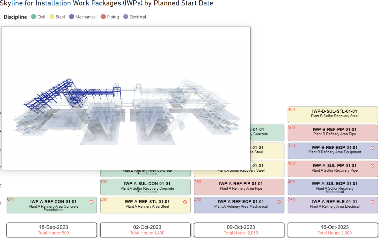
Skyline maps construction activities into groups or planned start and finish dates, laying them out as stacked cells along a timeline. Displaying Installation Work Packages over their planned start date, for example, shows the distribution of packages over time with clear emphasis on quantity and timing.
The visual provides:
- Timeline grouping of any value along a configurable axis, with date granularity from day to month
- Cell content built from a primary identifier, a description, a planned value, and secondary information
- Legend coloring driven by a field such as status or discipline, with editable colors
- Reverse fields that flip a cell to show three additional labels
- Drill through and data selection that cross-filter the rest of the report
- URL links that open a per-cell address from the cell itself
Getting Started
To begin using Skyline in Power BI, add it to your report and configure the data fields. The visual is available for free through the Power BI marketplace.
Gaining Access
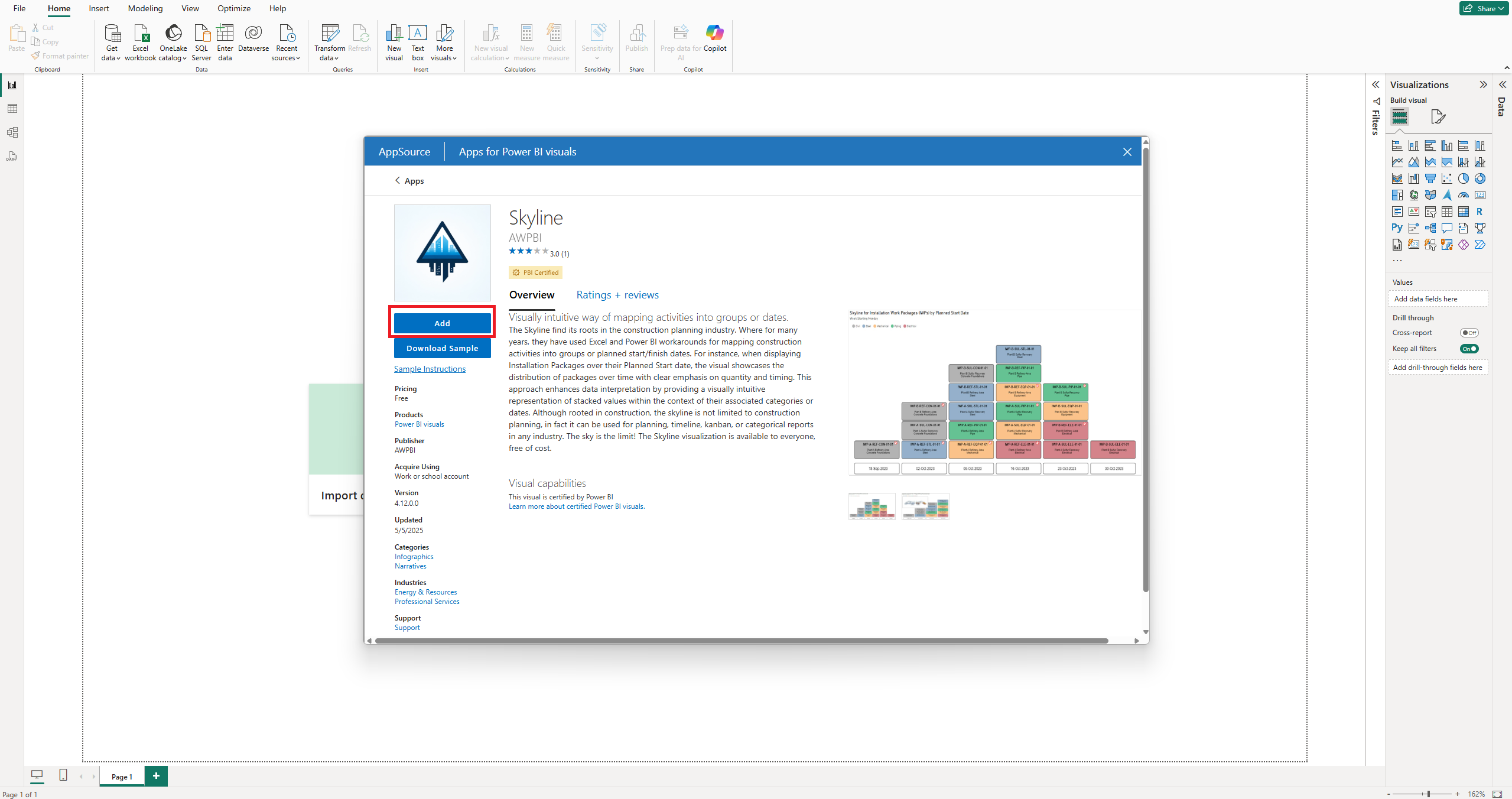
1. Open the visual marketplace
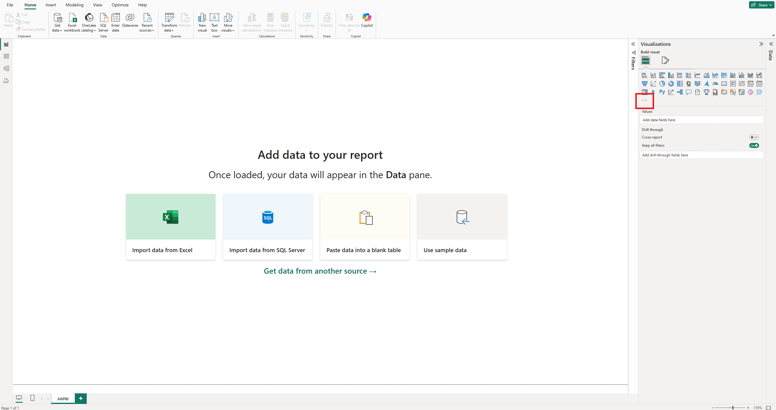
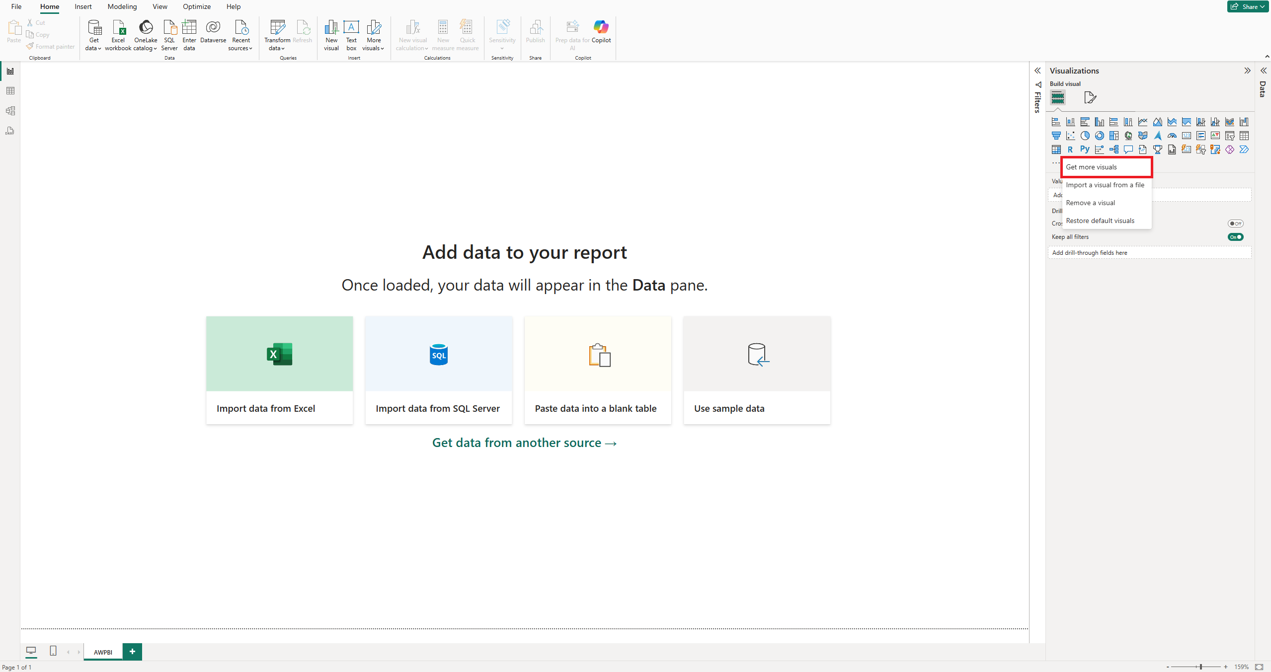
In the Visualizations pane, click the three dots at the bottom, then select Get more visuals.
2. Search for "Skyline"
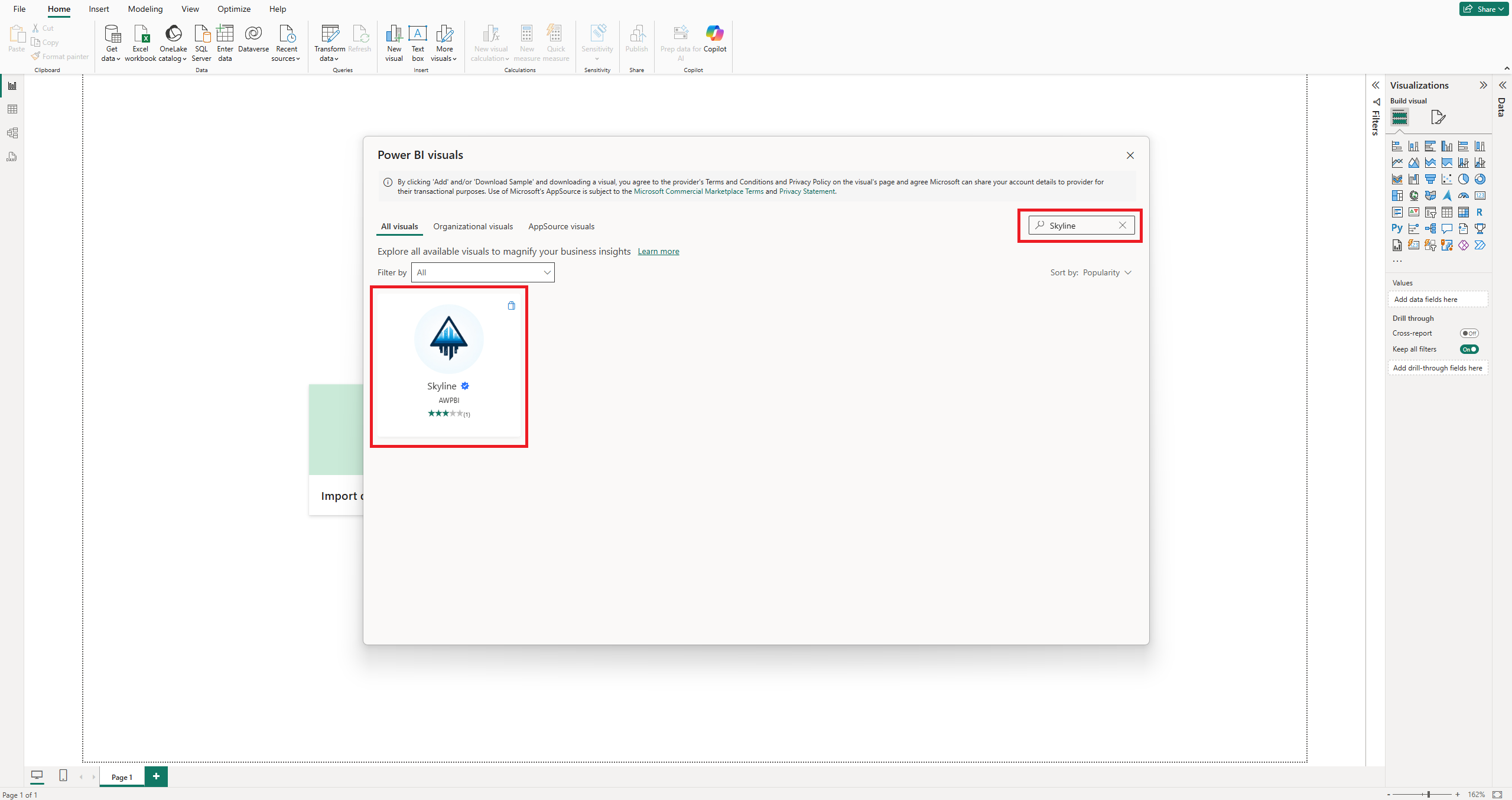
In the search bar of the marketplace window, type Skyline to locate the visual.
3. Add the visual
Click the visual, then click Add to insert it into your report environment.
Setting Data Fields
Once Skyline is on the canvas, map your dataset to it. With the visual selected, drag fields from the Data pane into the drop zones of the Build visual panel. Each well controls a different part of the layout, grouping, or cell content.
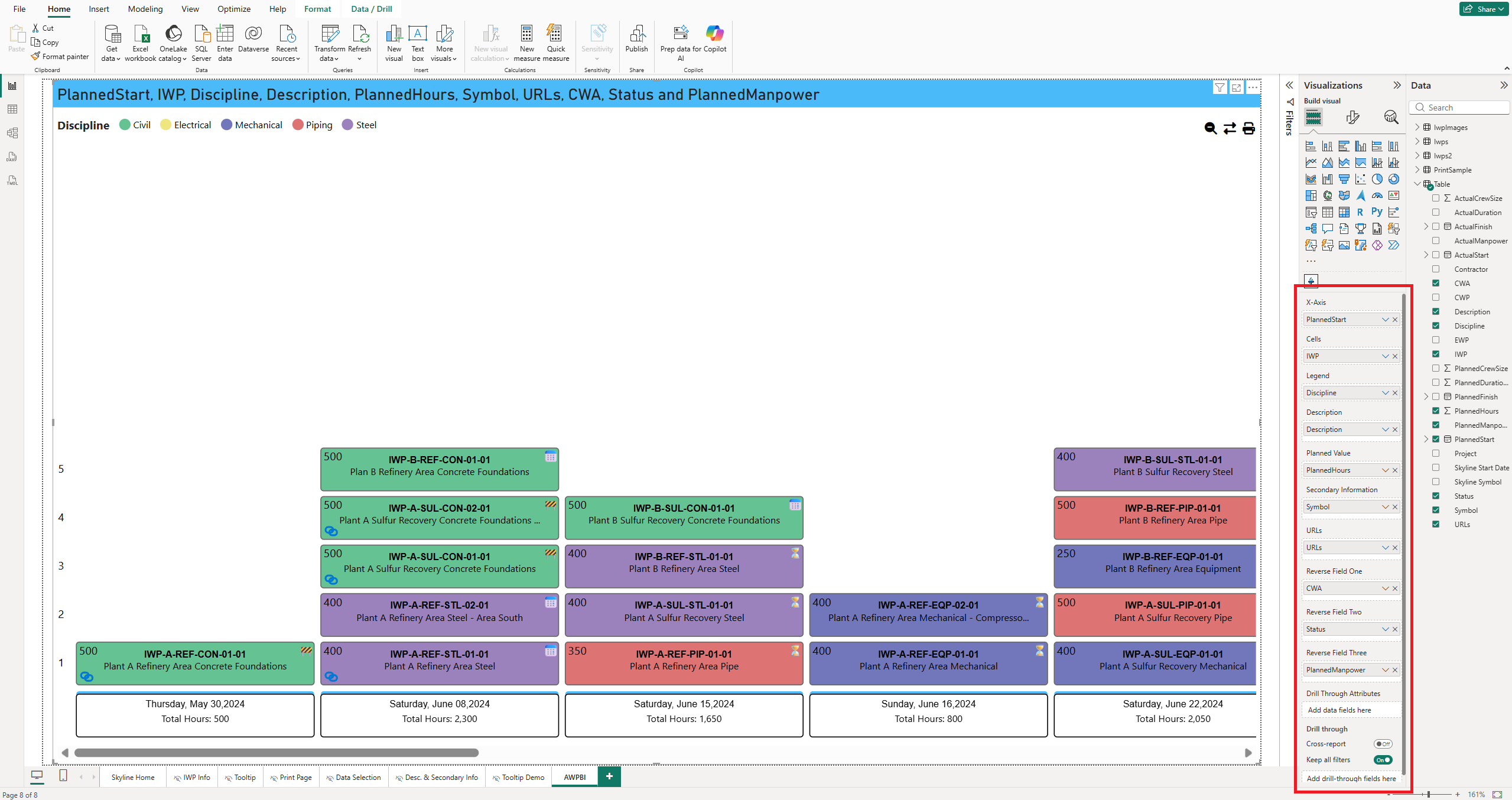
Note: The data wells accept specific types. Axis takes any value. Cells, Legend, Description, URLs, and Reverse Fields take text. Planned Value takes a number. Secondary Information takes text or a number.
Axis (Grouping)
Assign a date field such as Planned Start Date to organize the skyline on a timeline.
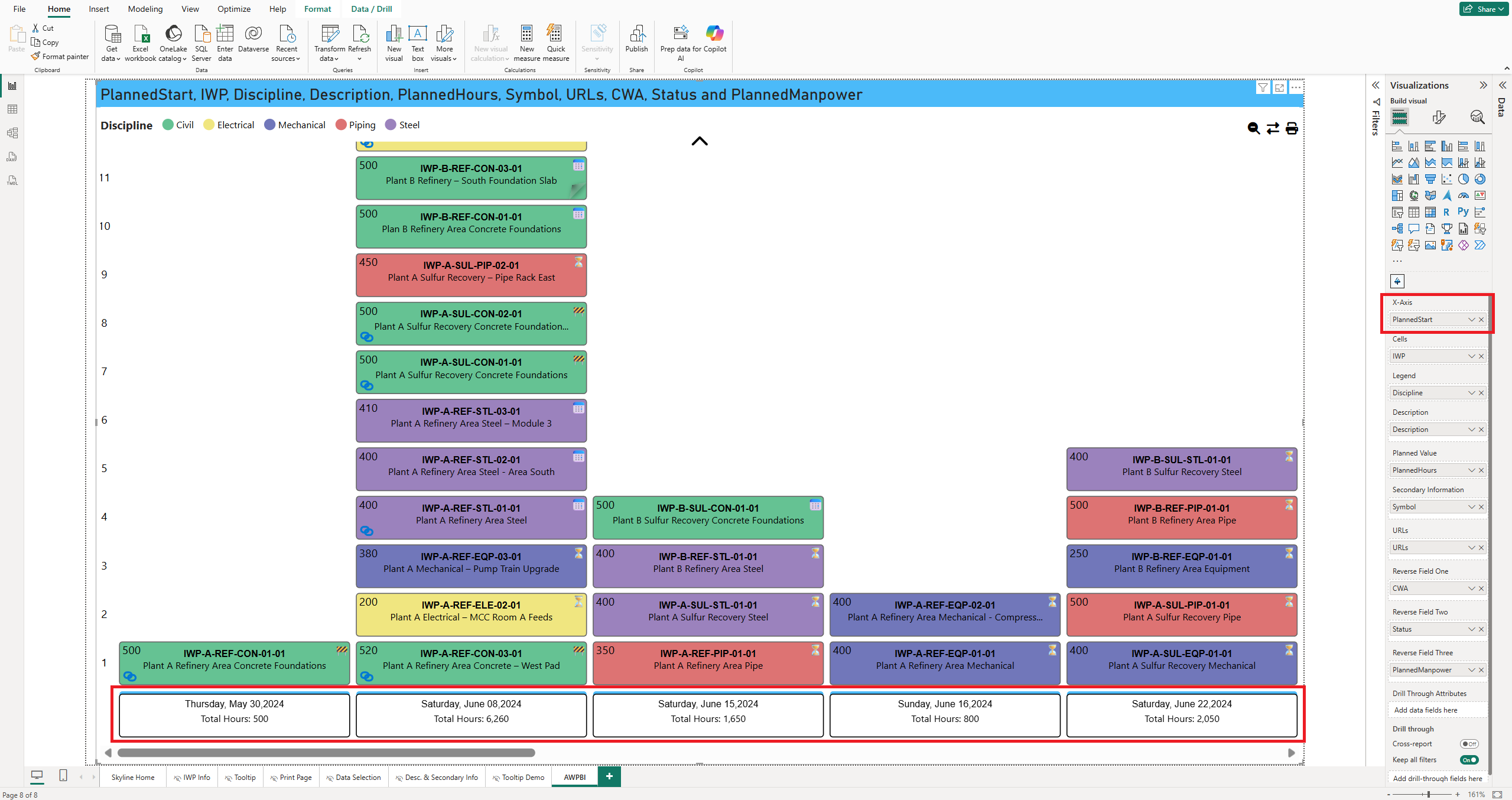
Tip: If your x-axis is a date field, grouping by week or month usually
reads better than by day. To group by the Monday of each week, use DAX such
as Skyline Start Date = 'Table'[Date] - WEEKDAY( 'Table'[Date], 3 ).
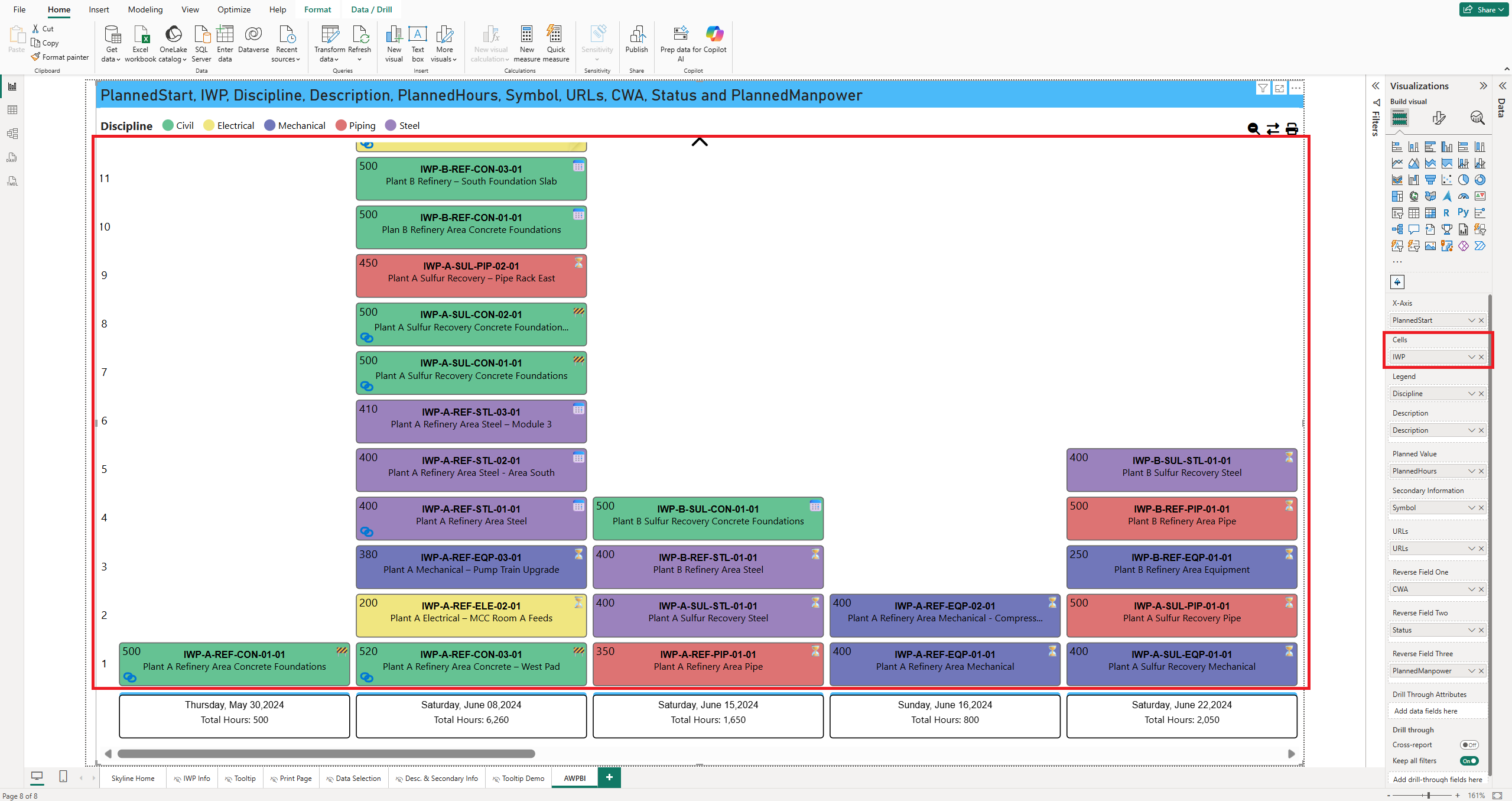
Cells
Drag in a primary identifier such as Installation Work Package (IWP) to populate the main skyline bars.
Legend
Use a field such as Status or Discipline to color-code the cells.
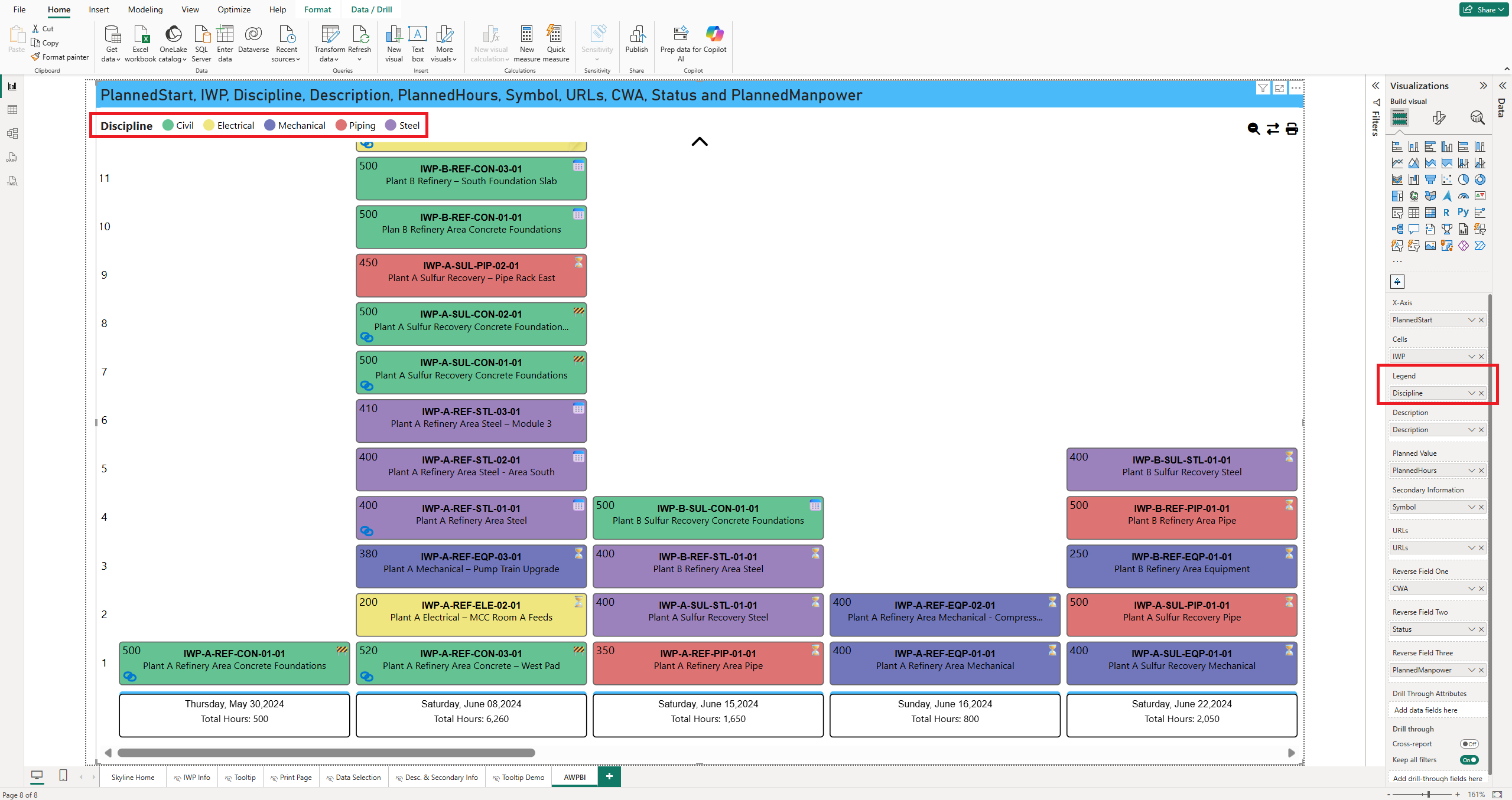
Tip: Click a legend item to highlight the cells that contain that value.
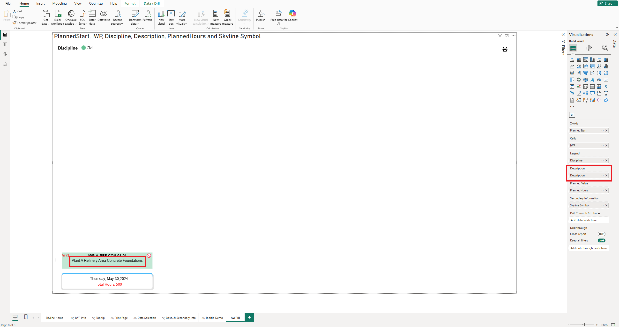
Description
Populate this with descriptive text to display context in the body of each cell.
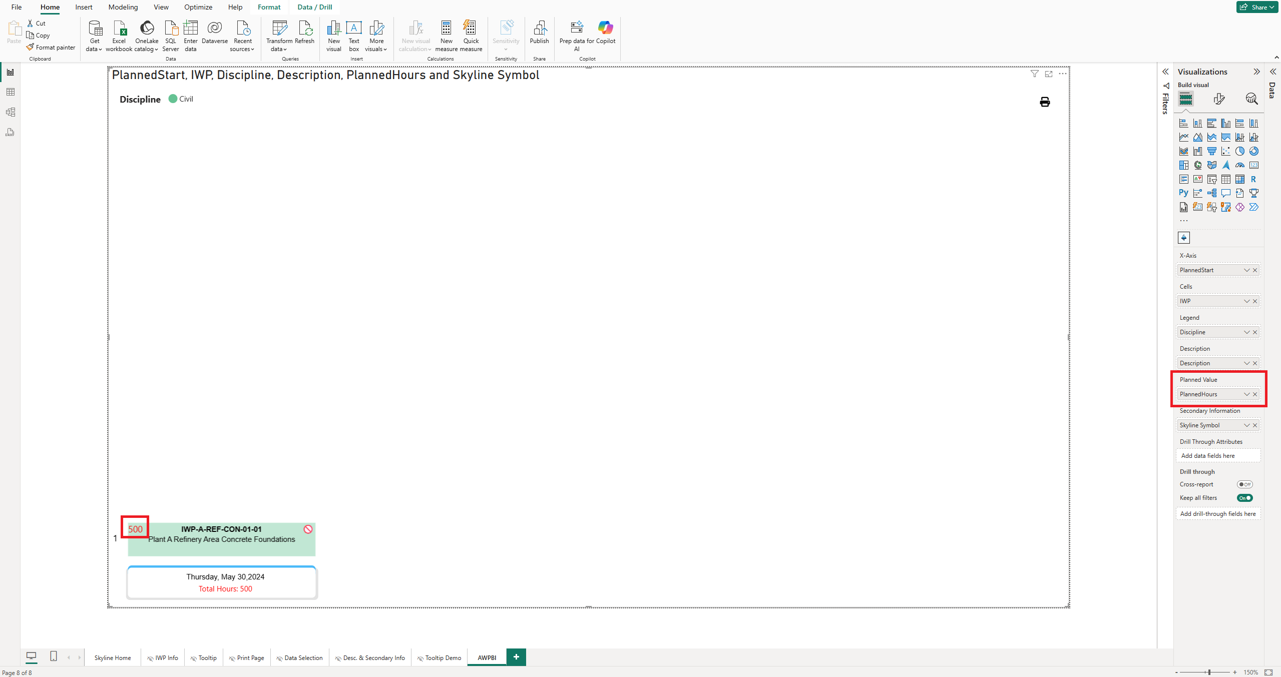
Planned Value
Include a numeric field such as Planned Hours to show a value in the top-left of each cell.
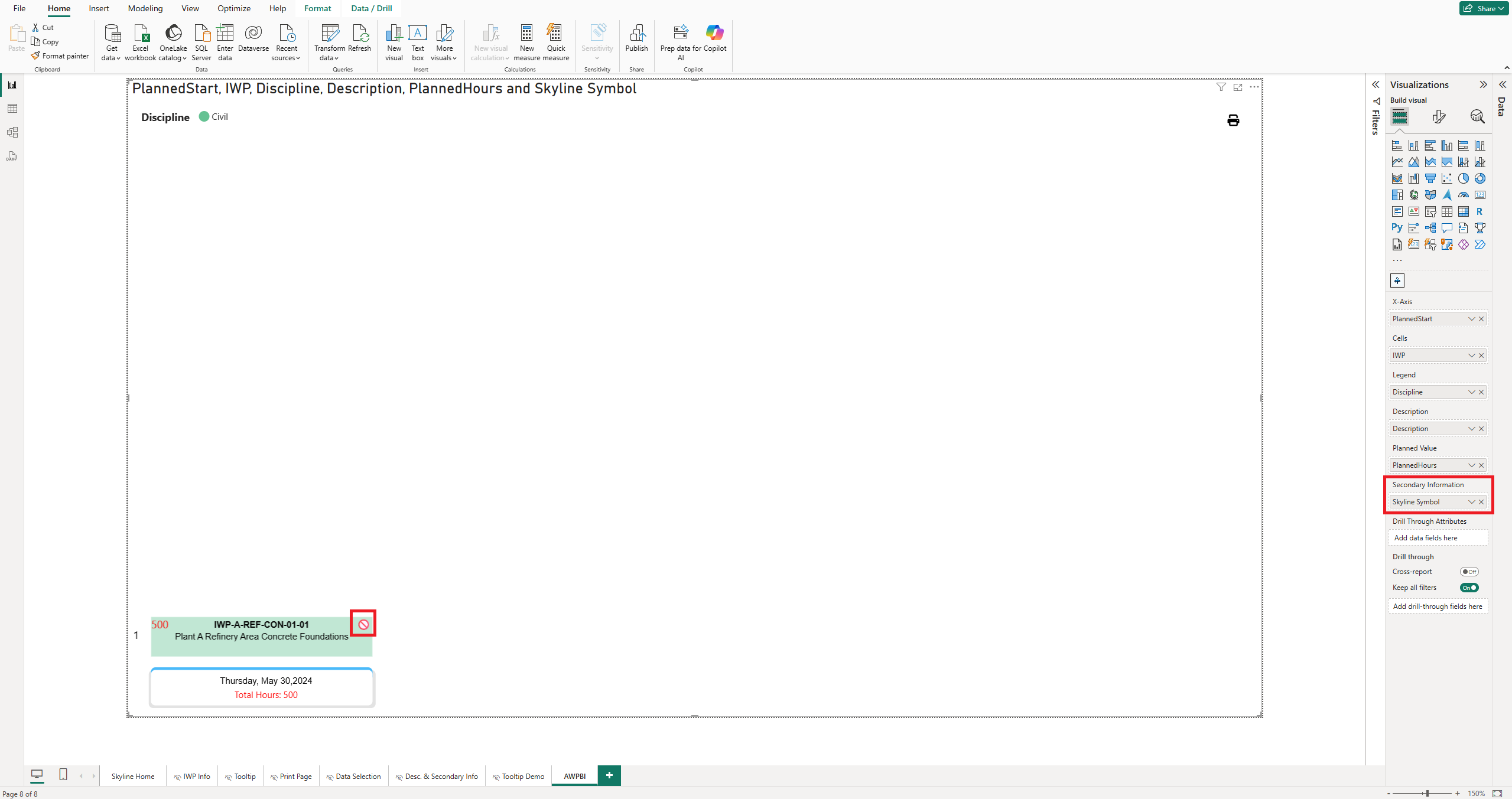
Secondary Information
Use symbolic or categorical data to place an icon or label in the top-right corner of each cell.
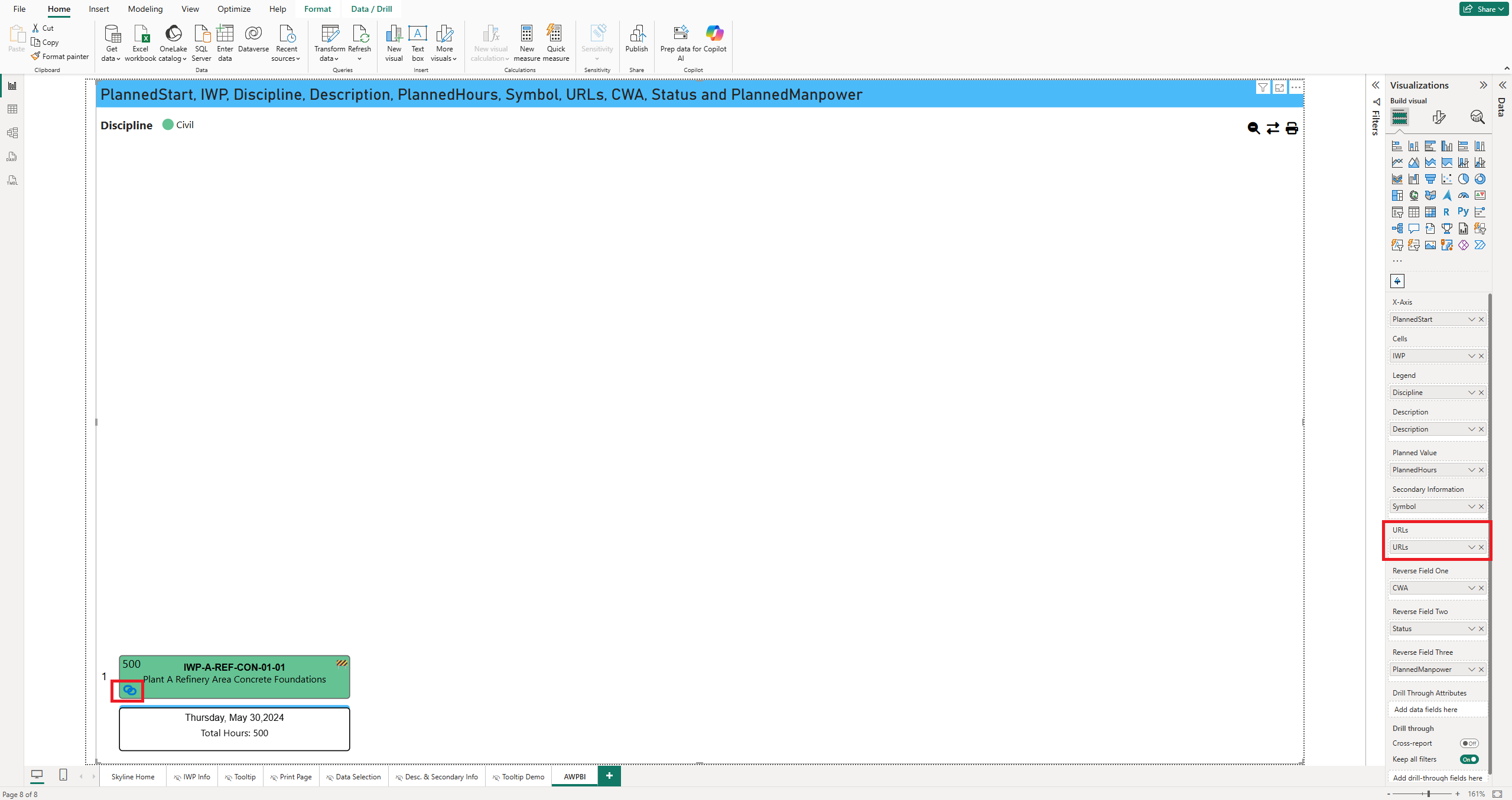
URLs
Populate this with a column of URLs to display a link icon in each cell. Clicking the icon opens the corresponding address.
Reverse Fields
Populate these three fields with descriptive text to display top, middle, and bottom labels on the reverse side of each cell.
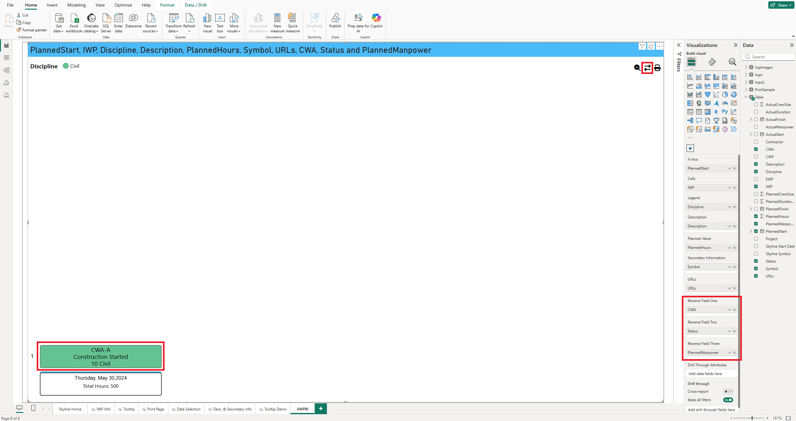
Tip: Flip a single cell with its corner button, or flip every cell at once with the Batch Reverse button.
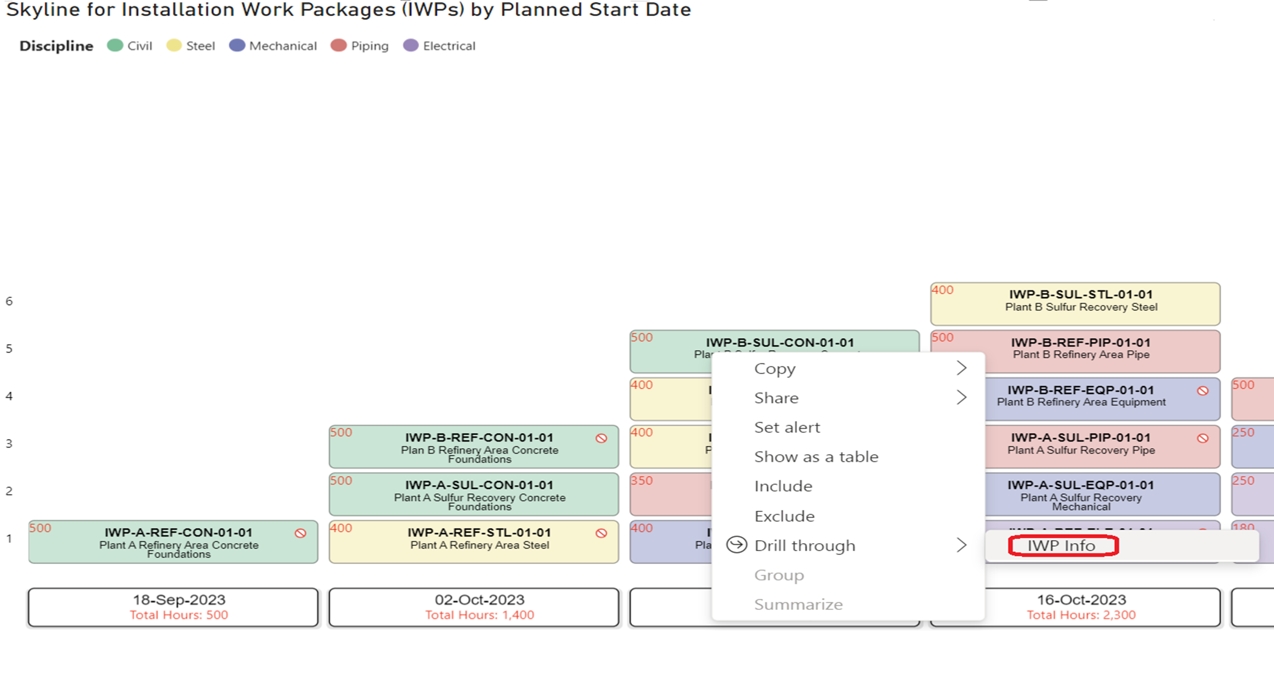
Drill Through Attributes
Add any fields you want available for right-click drill-through actions from the skyline.
Formatting
Customize the look and behavior of Skyline from the Format visual pane. These settings tune layout, styling, and interactivity.
Accessing Format Settings
1. Open the Format panel
With the visual selected, open the Format visual panel in Power BI.
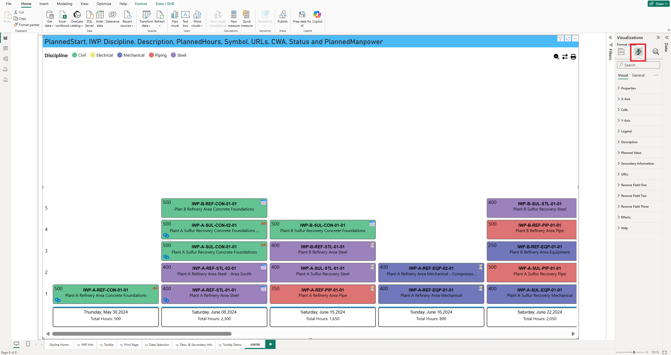
2. Expand formatting sections
Under the Visual tab, expand a formatting group such as Properties, Cells, X-Axis, or Legend to reveal its options.
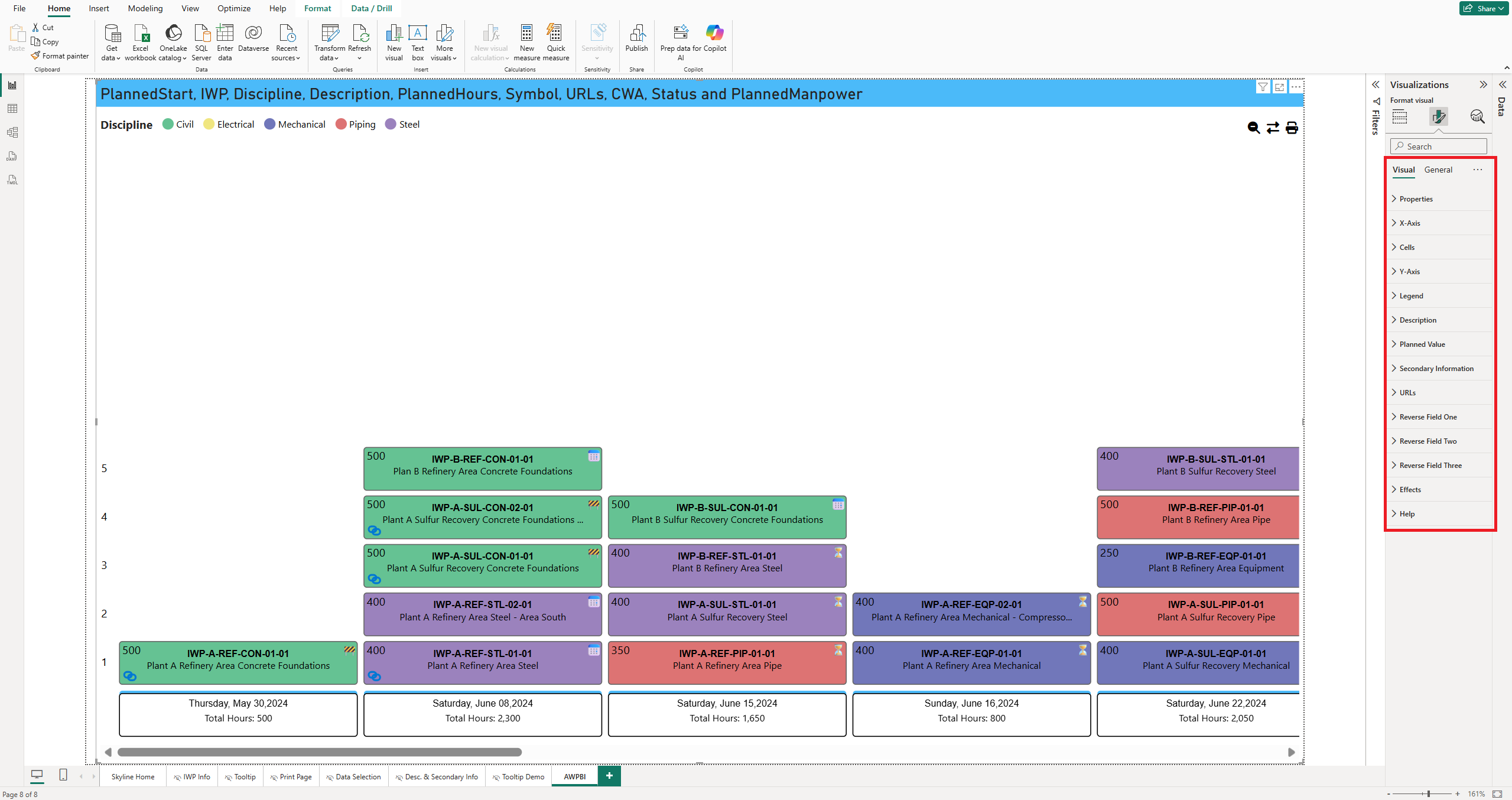
Properties
- Show Print. Displays a print button on the visual.
- Show Batch Reverse. Enables reversing multiple cells at once.
- Show Reset Zoom. Adds a button to restore the default zoom level.
- Column Width. Sets how wide each skyline column appears.
- Vertical Cell Separation. Adjusts spacing between rows.
- Horizontal Cell Separation. Adjusts spacing between columns.
- Show Scroll Indicator. Shows or hides the horizontal scroll guide.
- Scroll Background Color. Sets the background color of the scroll bar.
- Scroll Arrow Color. Sets the color of the scroll arrow.
Cells
- Cell Borders. Adjustable color, thickness, and corner rounding.
- Fonts. Font family, size, and color for cell content text.
- Expanded Cell. Controls how cell content expands or wraps.
- Cell Background. Applies a background fill color to each cell.
- Cell Height. Increases vertical space for content, useful with larger fonts or longer descriptions.
Note: Cell Background applies only when the Legend data well is empty. Once a legend field is populated, color is driven by the legend instead.
X-Axis
- Roof Border. Toggles the top border above the cells.
- Shadow. Applies a shadow effect to the X-Axis row.
- Freeze X-Axis. Keeps the X-Axis visible during horizontal scrolling.
- Show Empty Groups. Displays date intervals with no associated cells.
- X-Axis Height. Sets the vertical space for the X-Axis area in pixels.
- Date Grouping Granularity. Groups dates by day, week, month, and so on.
- Format. Sets the display format for grouped dates.
- Roof Color / Border Color. Colors for the top roof line and bottom border.
- Border Thickness / Corner Rounding. Adjusts border line thickness and rounding.
- Background Color. Applies a fill behind the X-Axis cells.
- Font Settings. Font family, size, and color for X-Axis text.
Y-Axis
- Show Counter. Displays a numerical row counter along the Y-Axis.
- Font Family. Font style for the Y-Axis labels.
- Font Size. Size of the Y-Axis text.
- Font Color. Color of the row labels.
Planned Value
- Font Settings. Font family, size, and color for the numeric value in the top-left of each cell.
- Descriptor. A text label shown beneath the numeric value, reflecting the field in use such as hours, quantity, or cost.
- Aggregation Type. How the values are calculated across grouped data: Sum, Average, Min, Max, Median, Standard Deviation, Variance, or Count.
Legend
- Show/Hide Legend. Toggles the visibility of the legend.
- Show/Hide Title. Displays or suppresses the title above the legend.
- Text Color. Sets the text color for legend labels.
- Position. Where the legend appears, such as left, right, or center.
- Color Selection. Manually adjusts the color assigned to each legend value.
Note: The legend supports a maximum of 10 editable colors. These correspond to the first 10 unique values in your legend field, sorted alphabetically.
Secondary Information
- Font Family. Typeface for the text or symbol in the top-right corner of each cell.
- Size. Size of the secondary information label.
- Font Color. Color of the label.
URLs
- Icon Size. Size of the URL link icon.
- Icon Color. Color of the URL link icon.
Reverse Fields
- Font Family. Typeface used for the reverse field text.
- Font Size. Size of the reverse field label.
- Font Color. Color of the reverse field text.
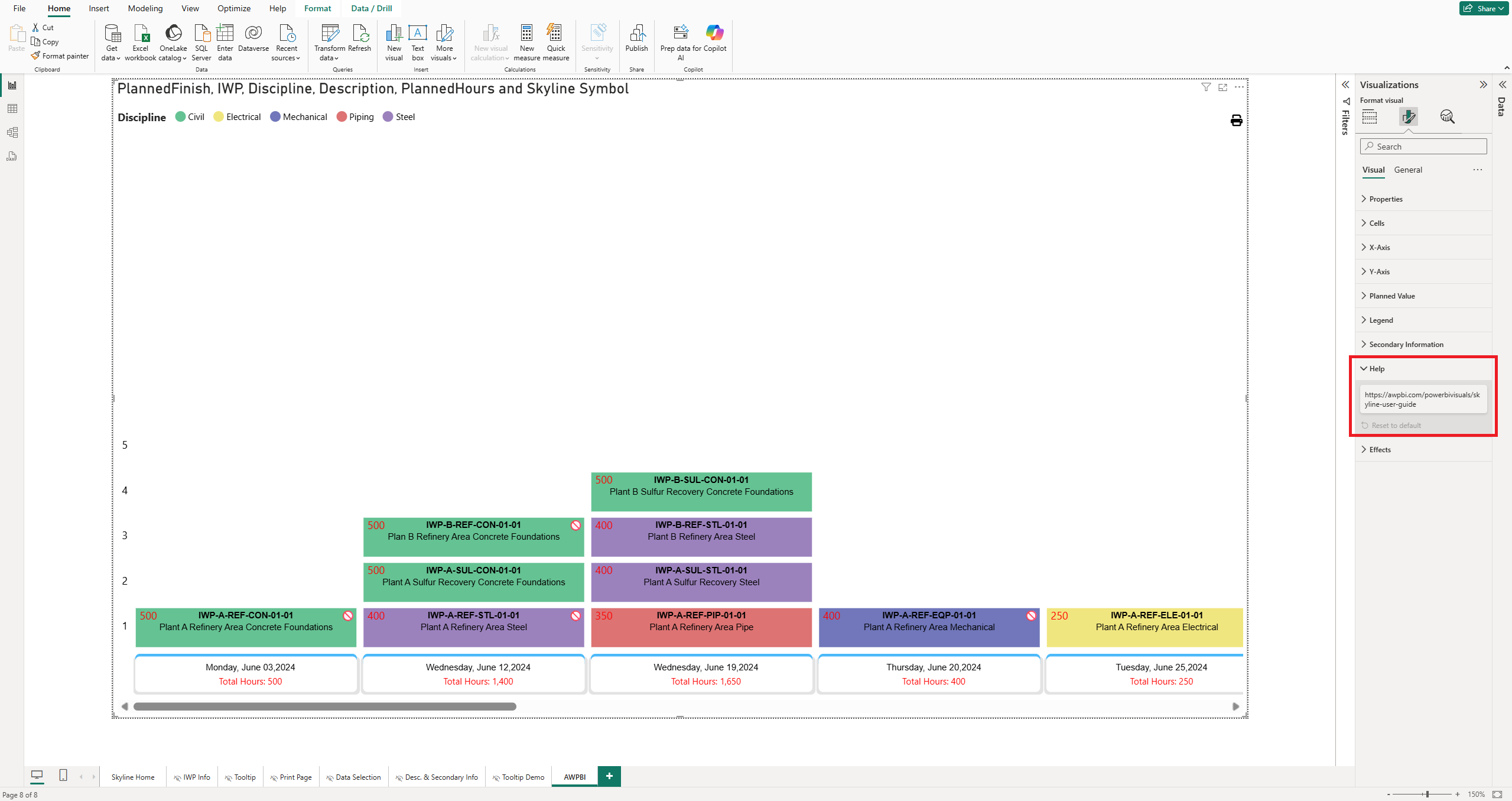
Help
- User Guide Link. Includes a link to this guide on the visual.
Effects
- Background Color. Applies a background fill behind the whole visual container.
- Zoom Level. The default zoom level for read-only views.
Tip: Adjust the zoom level by holding Ctrl while scrolling.
Functionality
Skyline is interactive beyond static viewing. Cells drive cross-filtering, open drill-through pages, and surface detail on hover.
Data Selection
Selecting a cell filters the rest of the report, highlighting matching data in other visuals such as tables, charts, and slicers. Multi-cell selection is supported for analyzing grouped or sequenced data together.
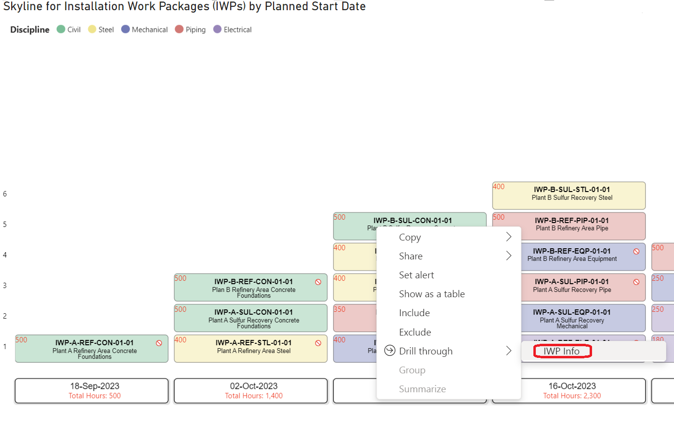
Drill Through
Right-click a cell to drill through to a report page filtered by that cell's data. Fields placed in the destination page's Drill through well are used to pass context.
Tooltip
Hovering over a cell displays a tooltip with additional context, such as a model preview or key attributes, without leaving the current view.