3D for Power BI embeds the Autodesk APS Viewer in a Power BI report. Model geometry and report data stay linked, so filtering and selection work in both directions.
What you get:
- Bidirectional filtering between the report and the model viewer
- Selection tools including select all, invert, select same, highlight, fit, show only, hide, and clear styling
- Color-coded visualization driven by a Power BI field, using colors you assign to each value
- Model panels for browsing, properties, custom hierarchies, saved views, and wildcard search
- 3D Reports for saving reusable filter, color, and legend setups and exporting them to PDF
- CSV export of model properties for the objects you select
Getting Started
Add the visual to your report from the Power BI marketplace, then point it at a model.
Gaining Access
1. Open the visual marketplace
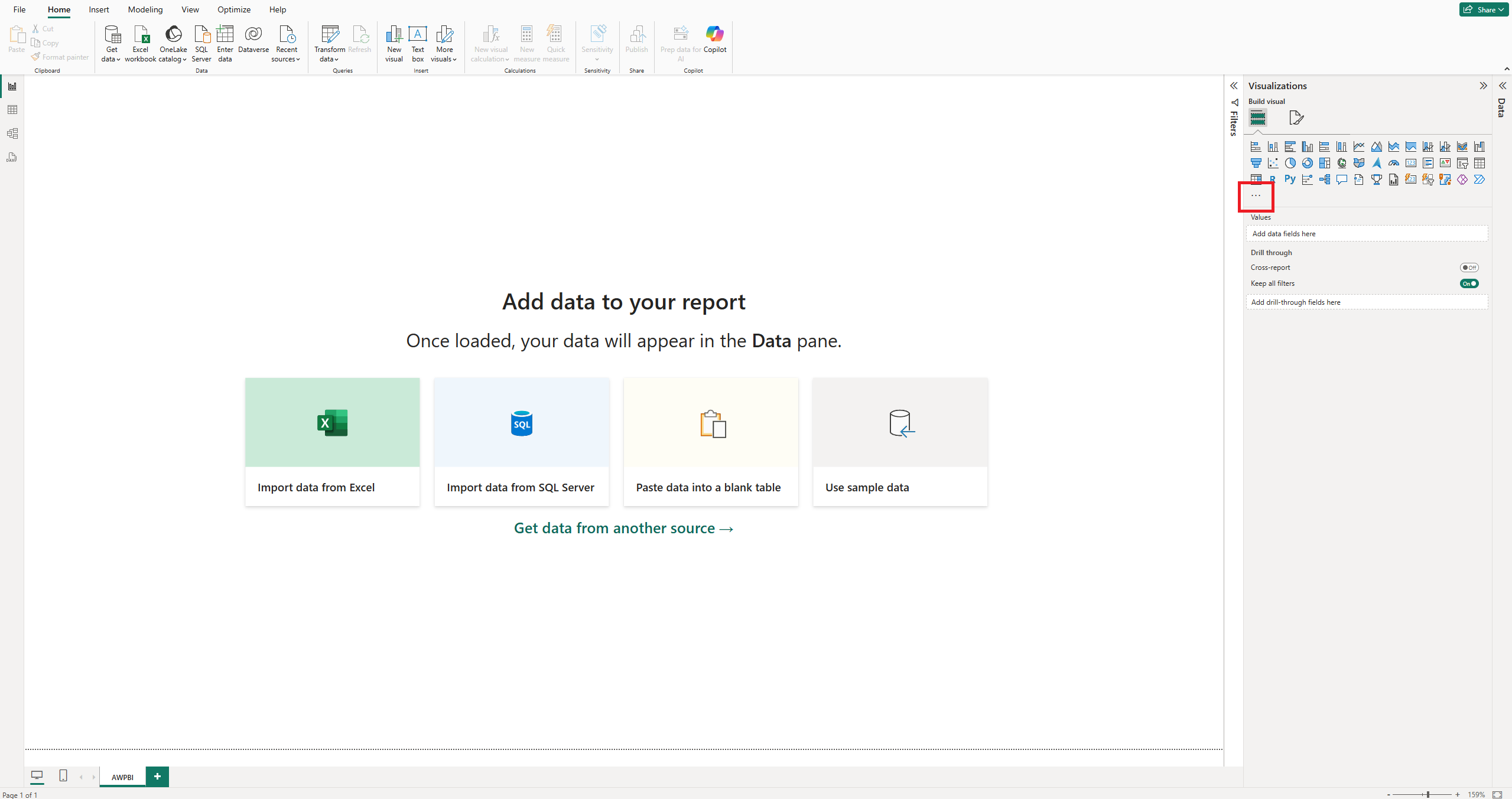
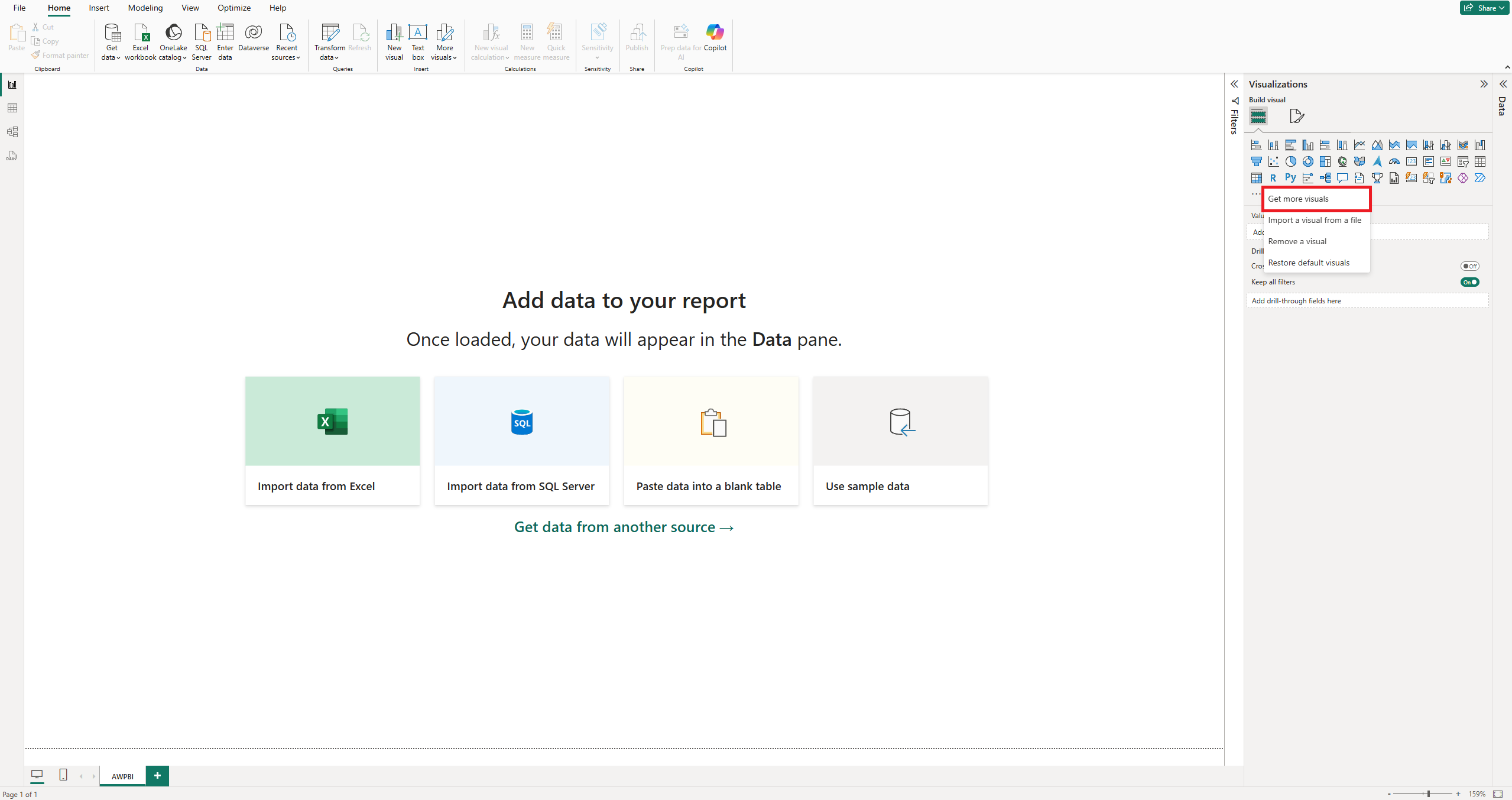
In the Visualizations pane, click the three dots at the bottom, then select Get more visuals.
2. Search for "AWPBI"
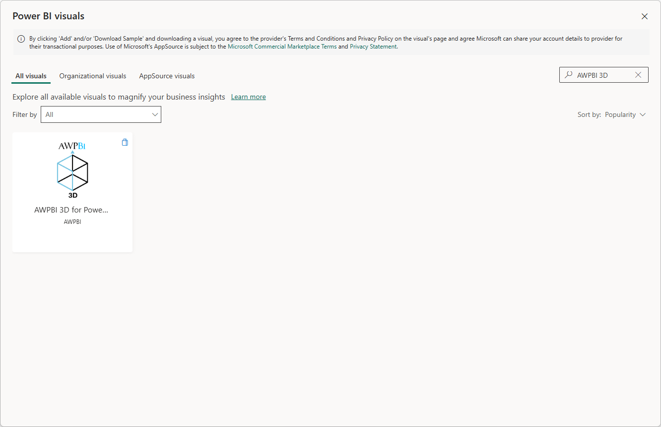
In the search bar of the marketplace window, type AWPBI to locate the visual.
3. Add the visual
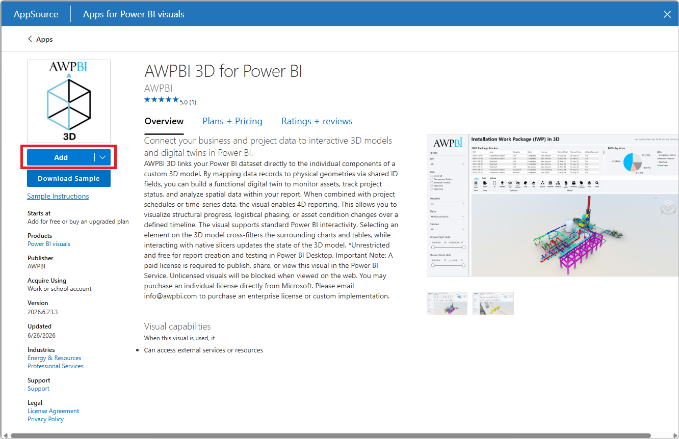
Click the visual, then click Add to insert it into your report environment.
Selecting a Model Source
Once the visual is on the report canvas, it opens the model source picker. A navigation bar runs down the side of the picker with one entry per source, and the Home tab shows the same sources as a grid of cards.
The available sources are:
- Demo Model. Load the bundled sample model. No setup or account needed.
- Upload. Upload your own model and load it once it has been processed.
- Shares. Connect via URN and endpoint to load from a Shares instance.
- openAWP. Sign in to your self-hosted platform and browse projects.
- ACC. Browse Autodesk Construction Cloud hubs, projects, and folders.
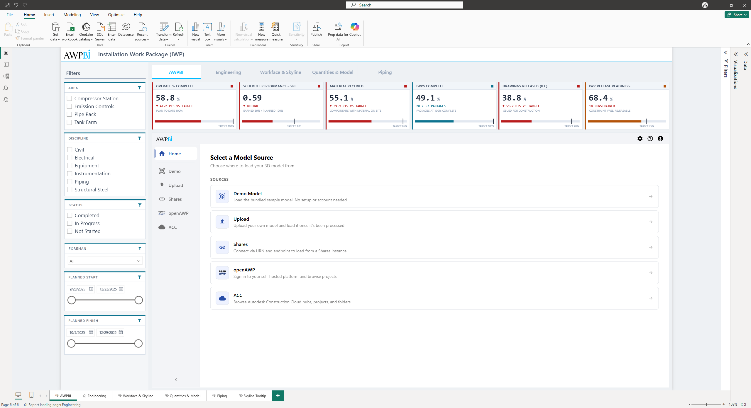
Note: The Demo Model is available to everyone. Upload, Shares, openAWP, and ACC require a licence. Without one, those entries appear locked and selecting one shows a message in Power BI rather than opening the source.
Tip: The navigation bar collapses to icons on narrow layouts. Use the control at the bottom of the bar to expand or collapse it yourself.
Demo Model
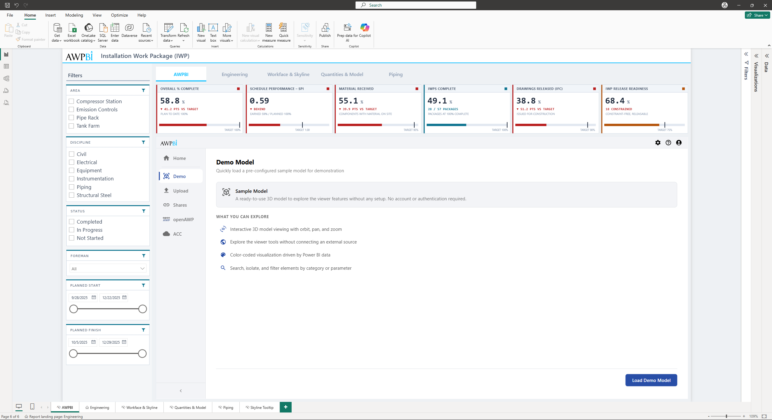
The demo model is the fastest way to try things out before pointing the visual at real project data.
Open the Demo tab and load it. There is nothing to configure.
Upload
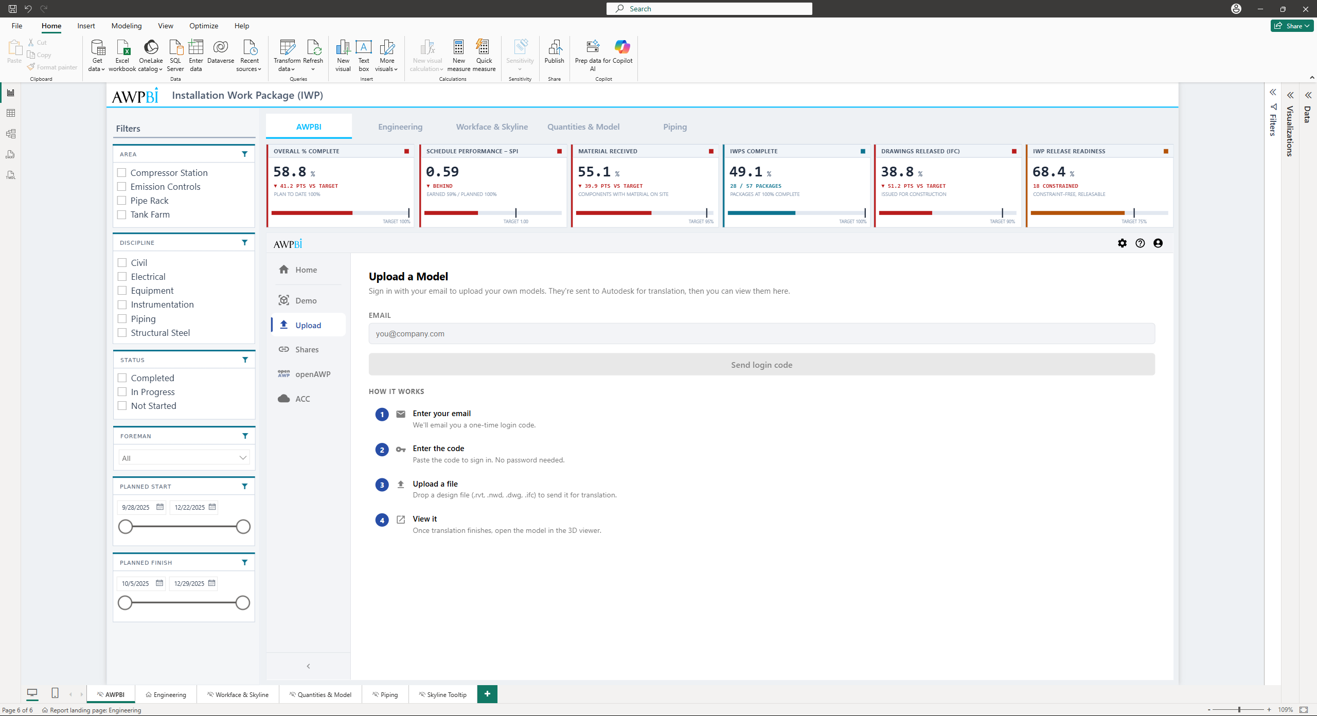
Upload a design file directly from the visual. The file is sent to Autodesk for translation, and once translation finishes you can open it in the viewer.
Supported formats include .rvt, .nwd, .dwg, and .ifc.
1. Sign in with your email
Open the Upload tab and enter your email address, then click Send login code. There is no password.
2. Enter the code
Paste the six-character code from the email and click Verify and continue.
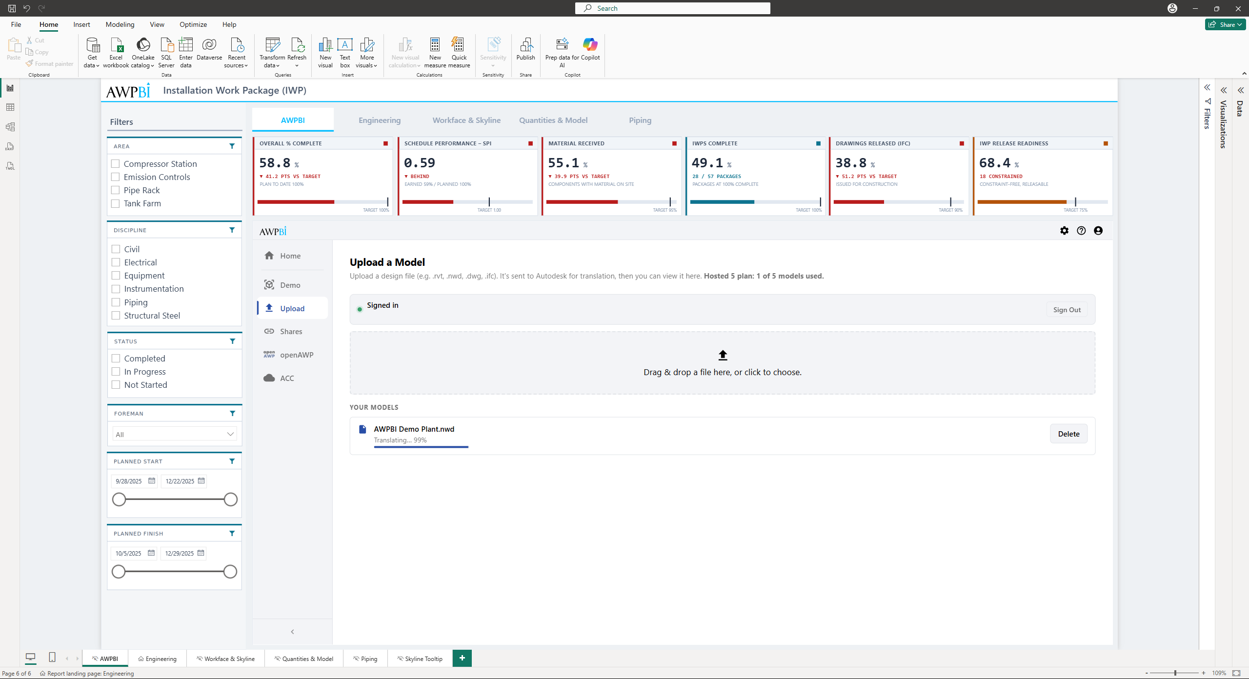
3. Upload a file
Drop a design file onto the upload area, or browse for one. The panel shows live translation progress while Autodesk processes the file.
4. View the model
When translation finishes, the model appears under Your Models marked ready to view. Select it to open it in the 3D viewer.
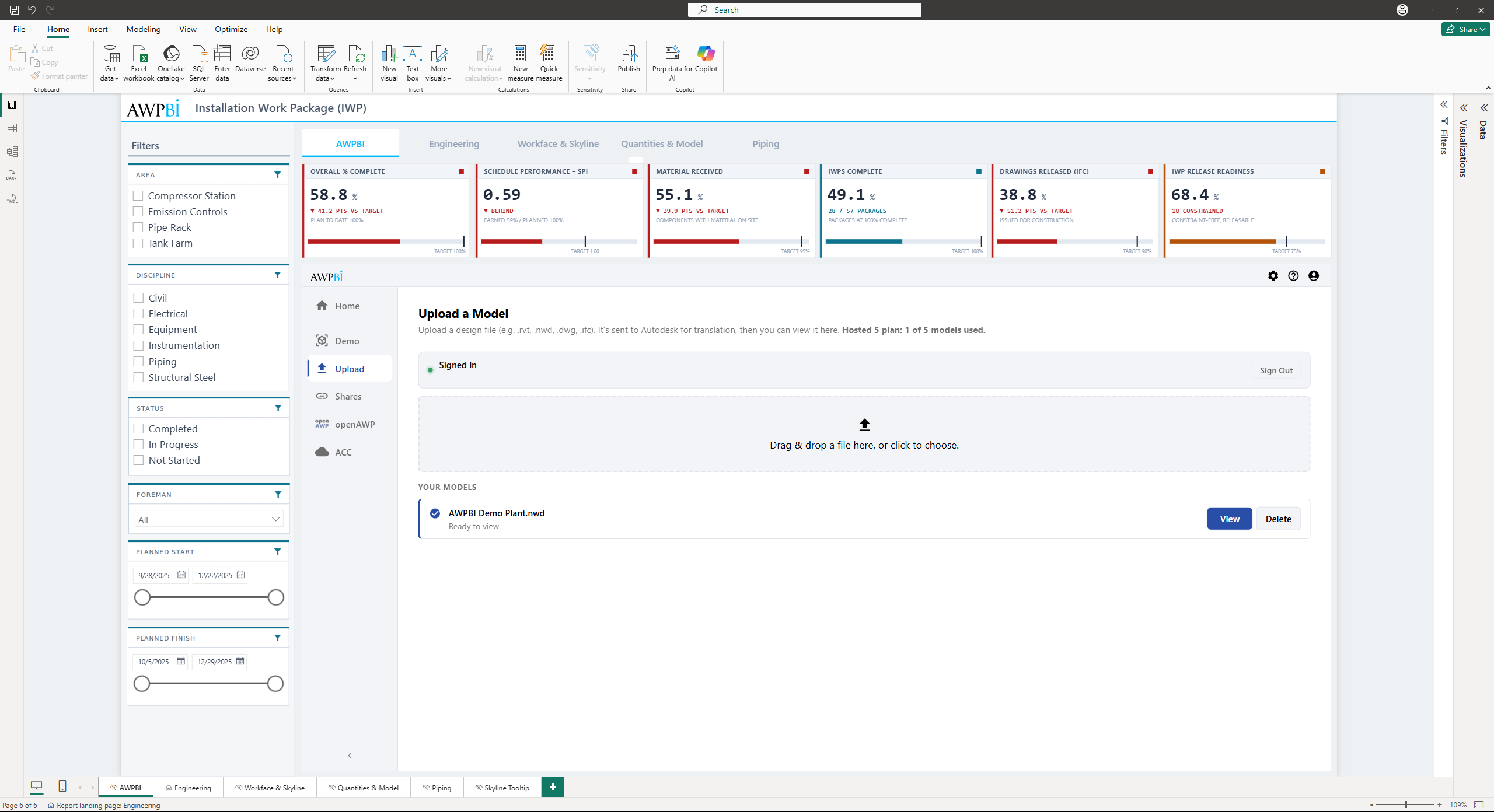
Note: The number of models you can keep uploaded depends on your plan, and the panel shows your current usage. Models that exceed your plan's allowance are locked rather than deleted, and the panel shows how long you have to restore them.
Shares
Load one specific model by giving the visual its URN and a Shares App endpoint. The Shares App mints a temporary token for that model, so the report opens it without anyone signing in to ACC.
Setting up the Shares App
Use the Shares App to hand out one ACC or BIM 360 model without opening up the whole project. The result is a read-only link that loads a single model into Power BI.
Note: For more information on setting up and using the Shares App, refer to the APS Shares App documentation.
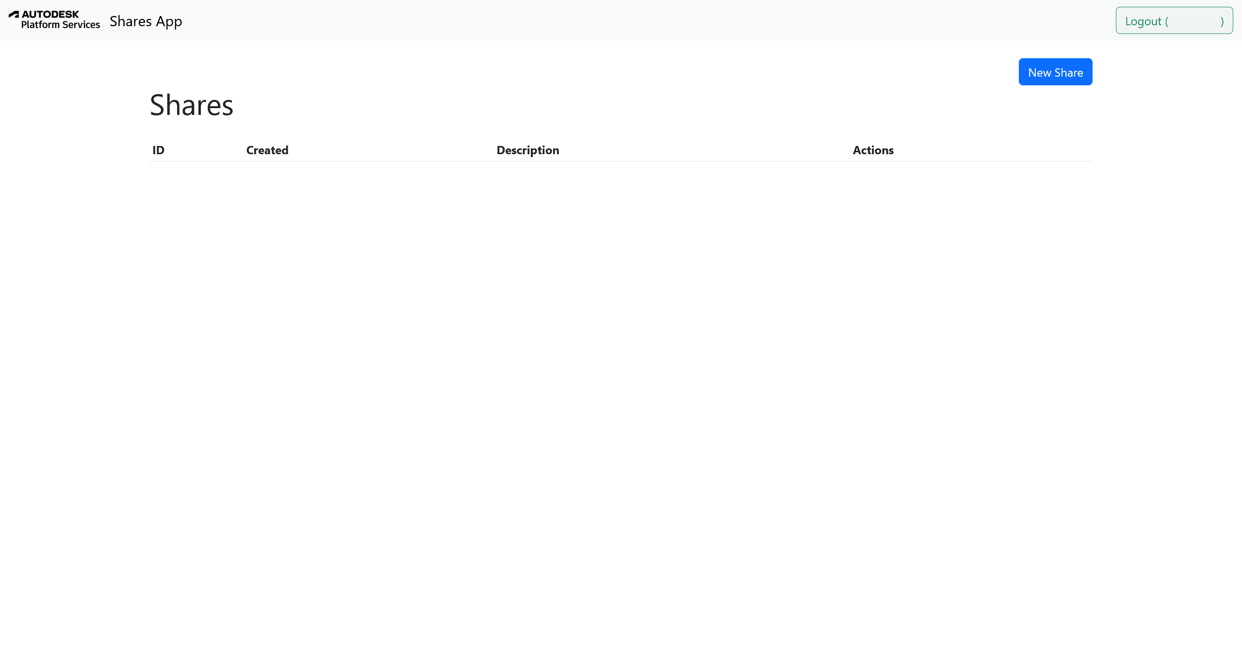
1. Go to the Shares App and sign in
Open the Shares App portal and sign in using your Autodesk credentials via 3-legged OAuth.
2. Open the New Share dialog
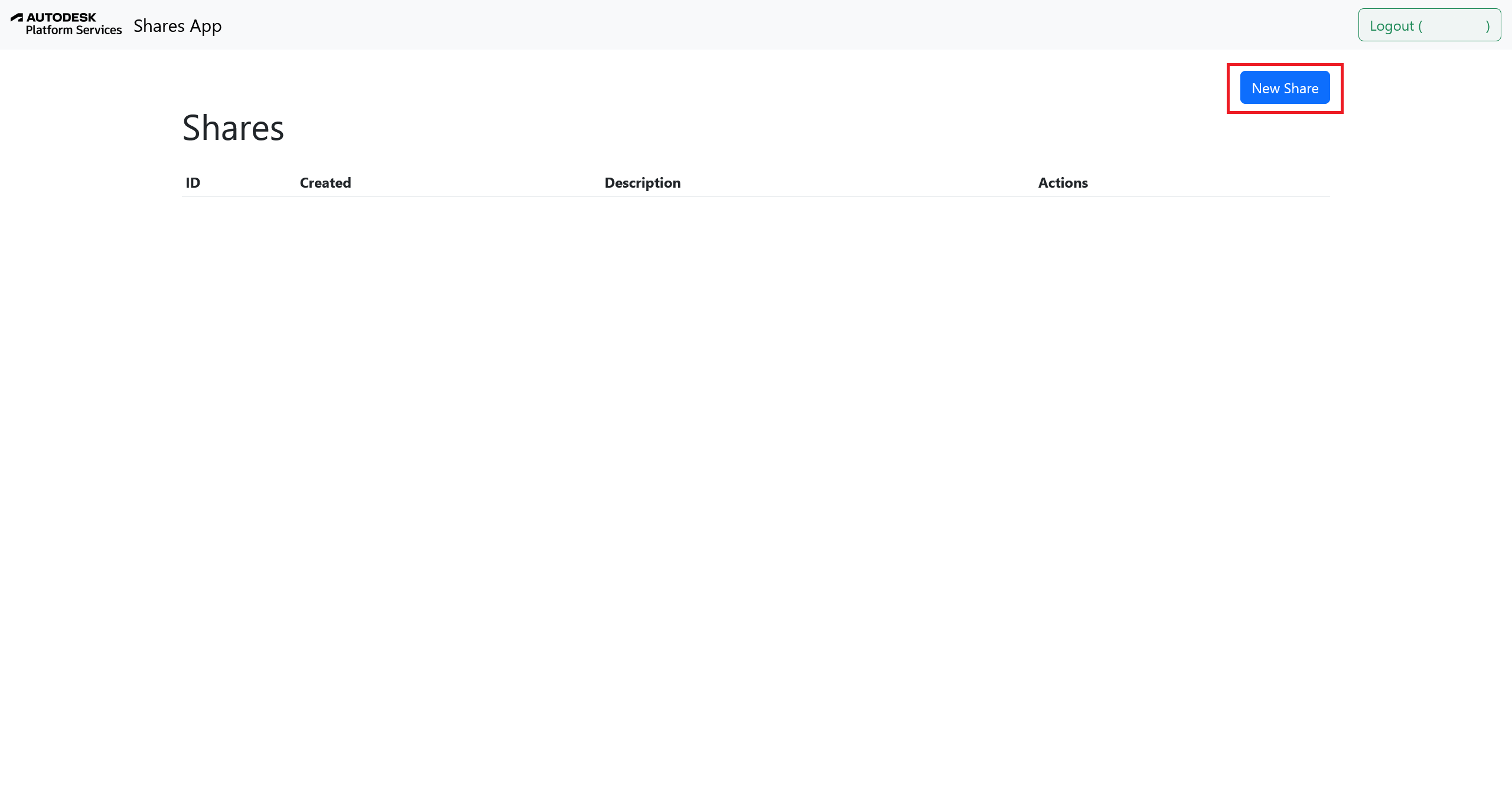
Click the New Share button at the top right. This opens a popup dialog where you can configure your share.
3. Copy the Client ID and Application Name
In the New Share popup:
- Paste the base64-encoded URN of your model into the URN field.
- Optionally, add a description for easier reference.
- Note the Client ID and Application Name displayed in the blue box.
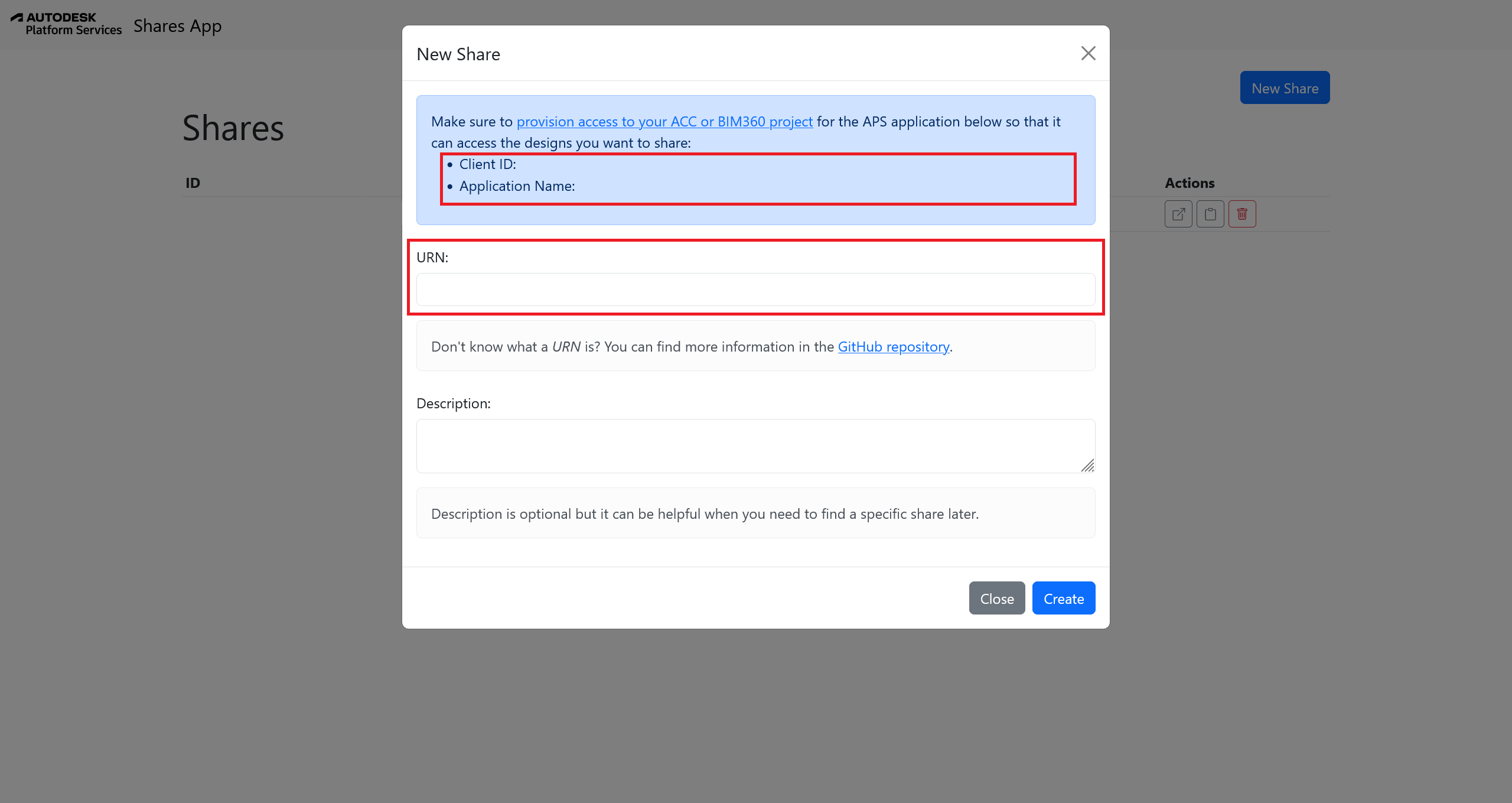
Note: The Client ID and Application Name are required to authorize the app in Autodesk Construction Cloud (ACC) or BIM 360.
Tip: Do not have the URN? You can retrieve it via the Model Derivative API
or the ACC APIs. After opening your design in Autodesk Construction Cloud,
open the browser console and type NOP_VIEWER.model.getData().urn to retrieve
the URN.
4A. Open ACC Admin
Log in to your Autodesk Construction Cloud (ACC) Admin portal and navigate to Account Admin > Custom Integrations > Add custom integration.
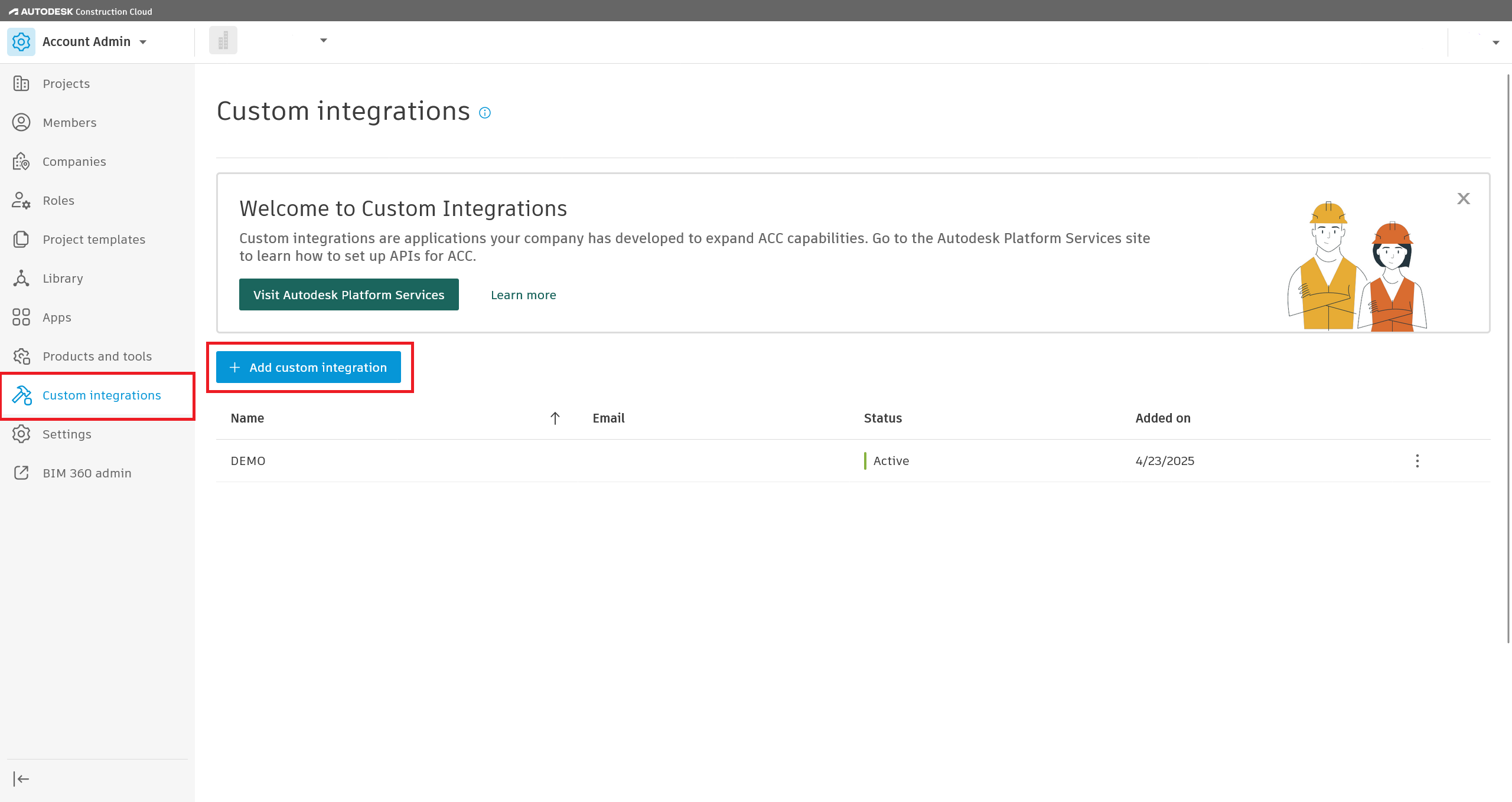
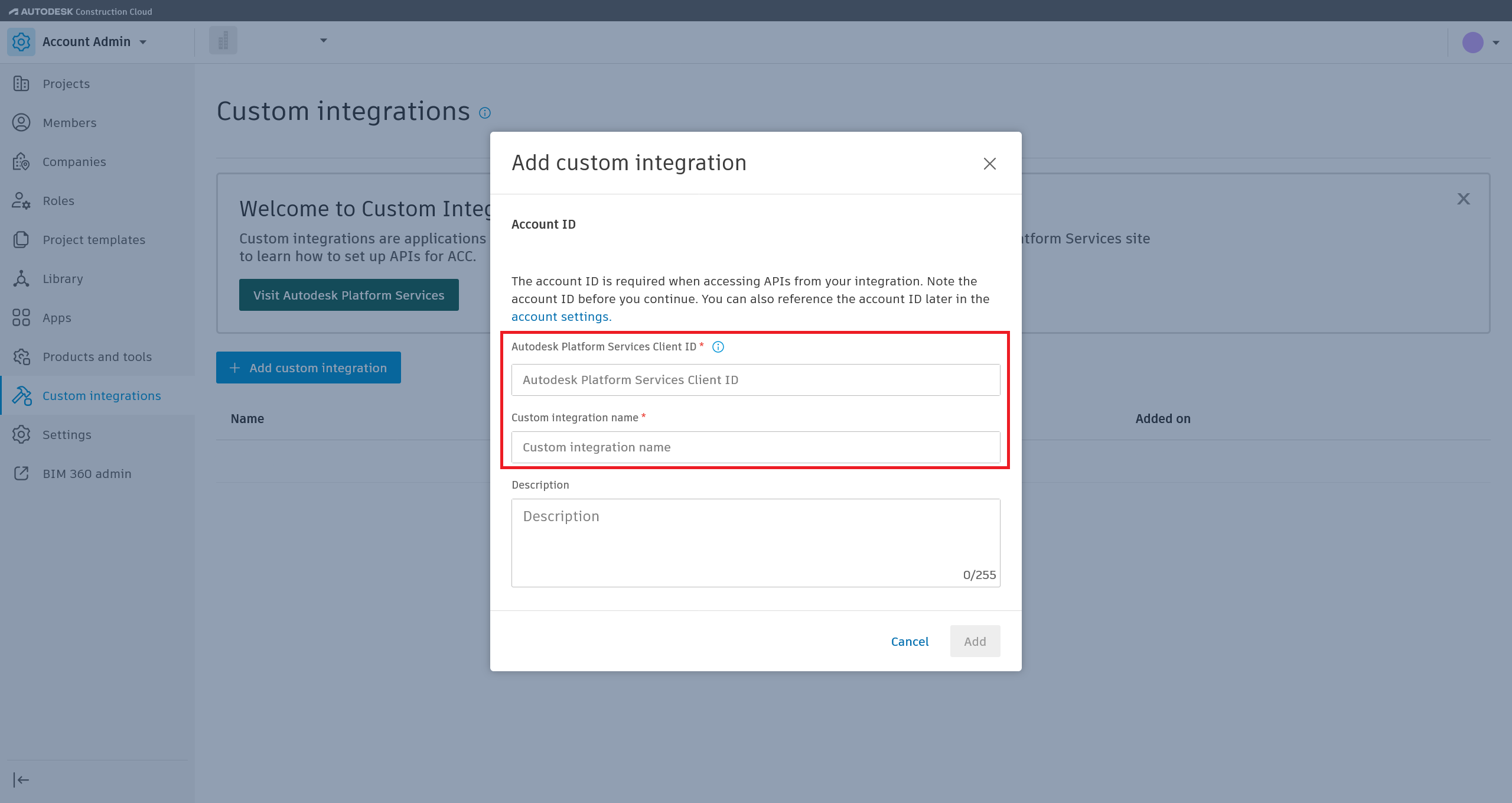
5A. Add the Client ID and Application Name
Click Add Custom Integration, paste the Client ID and Application Name from the Shares App, then add and confirm. Once saved, this Client ID can request scoped view-only access to models from your ACC projects.
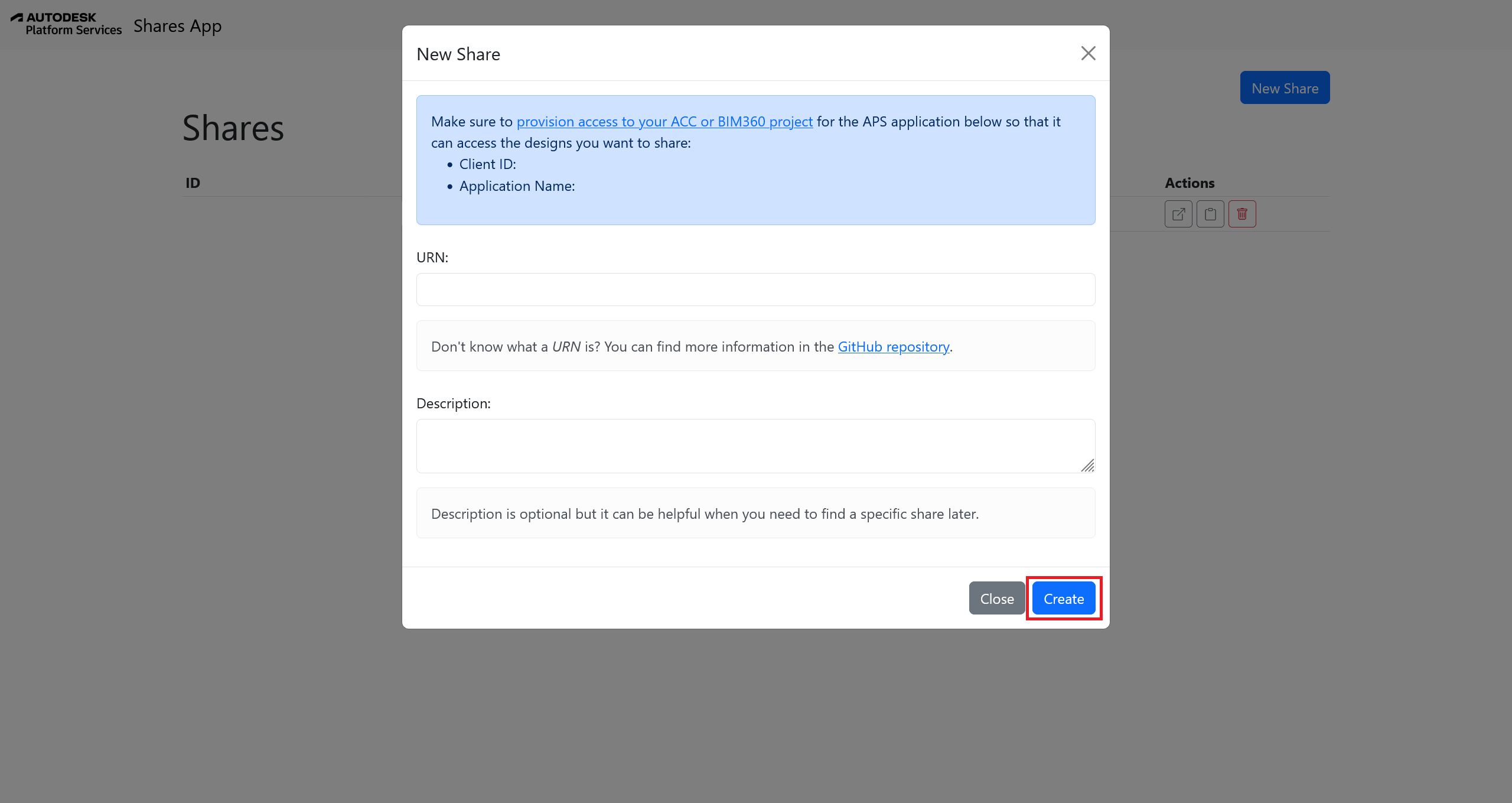
6. Finish creating the share
Back in the Shares App, click Create to finalize the share. The model appears in your Shares list with a unique endpoint link.
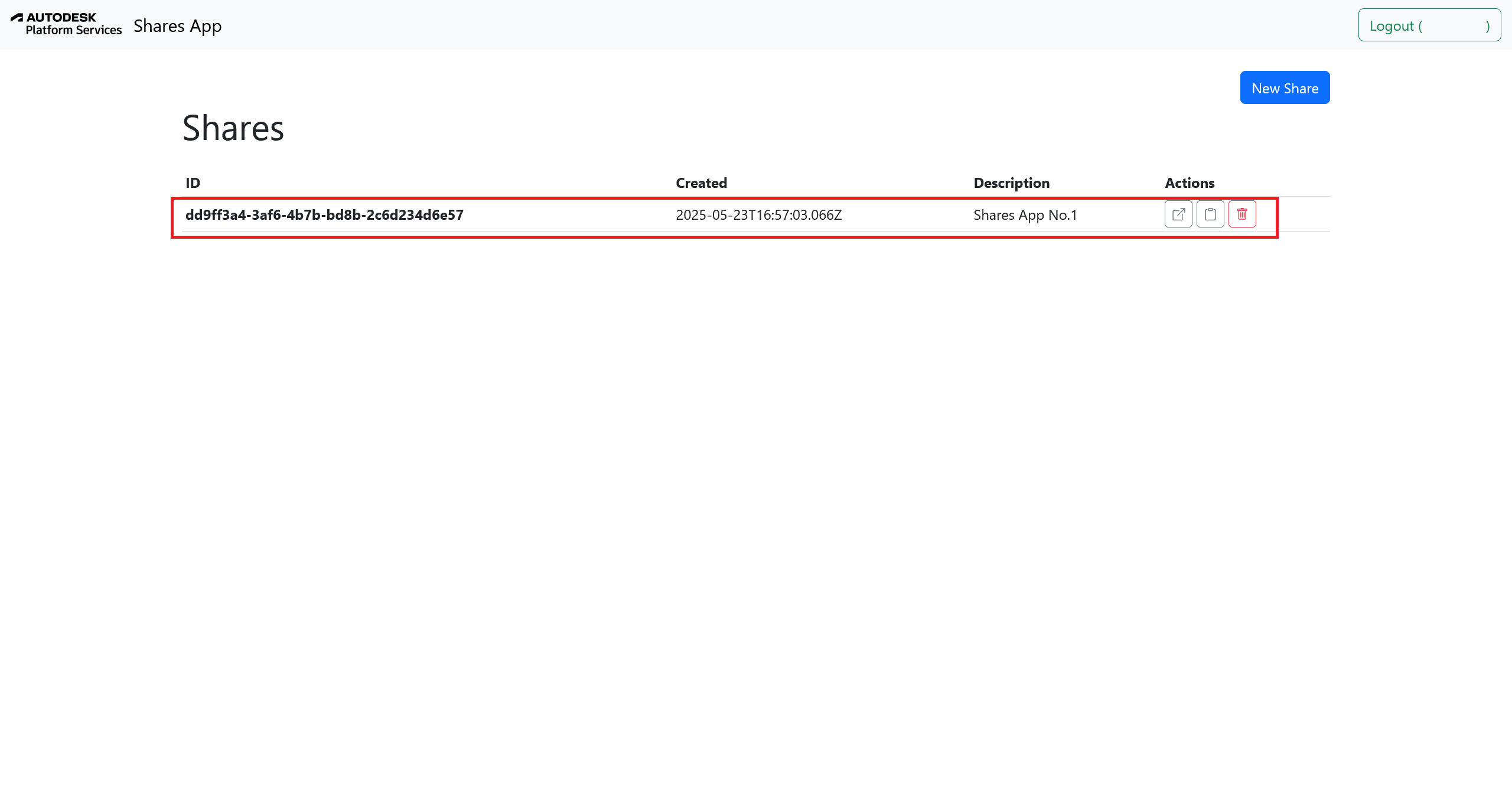
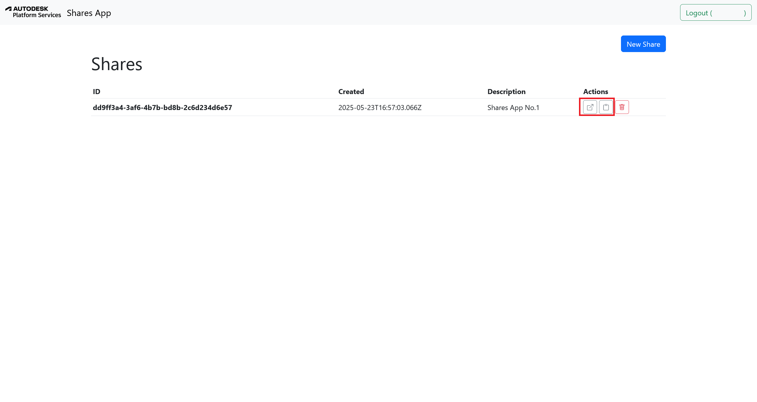
Copy both:
- The URN. Click the Open in new tab button to view the URN.
- The endpoint link. Click the Copy to clipboard button to copy the Shares App endpoint.
7. Load the model in Power BI
Open the Shares tab in the model source picker, then paste the URN into Shares URN and the share link into Shares App Endpoint. The visual fetches a viewer-ready token and loads the model directly into the embedded viewer.
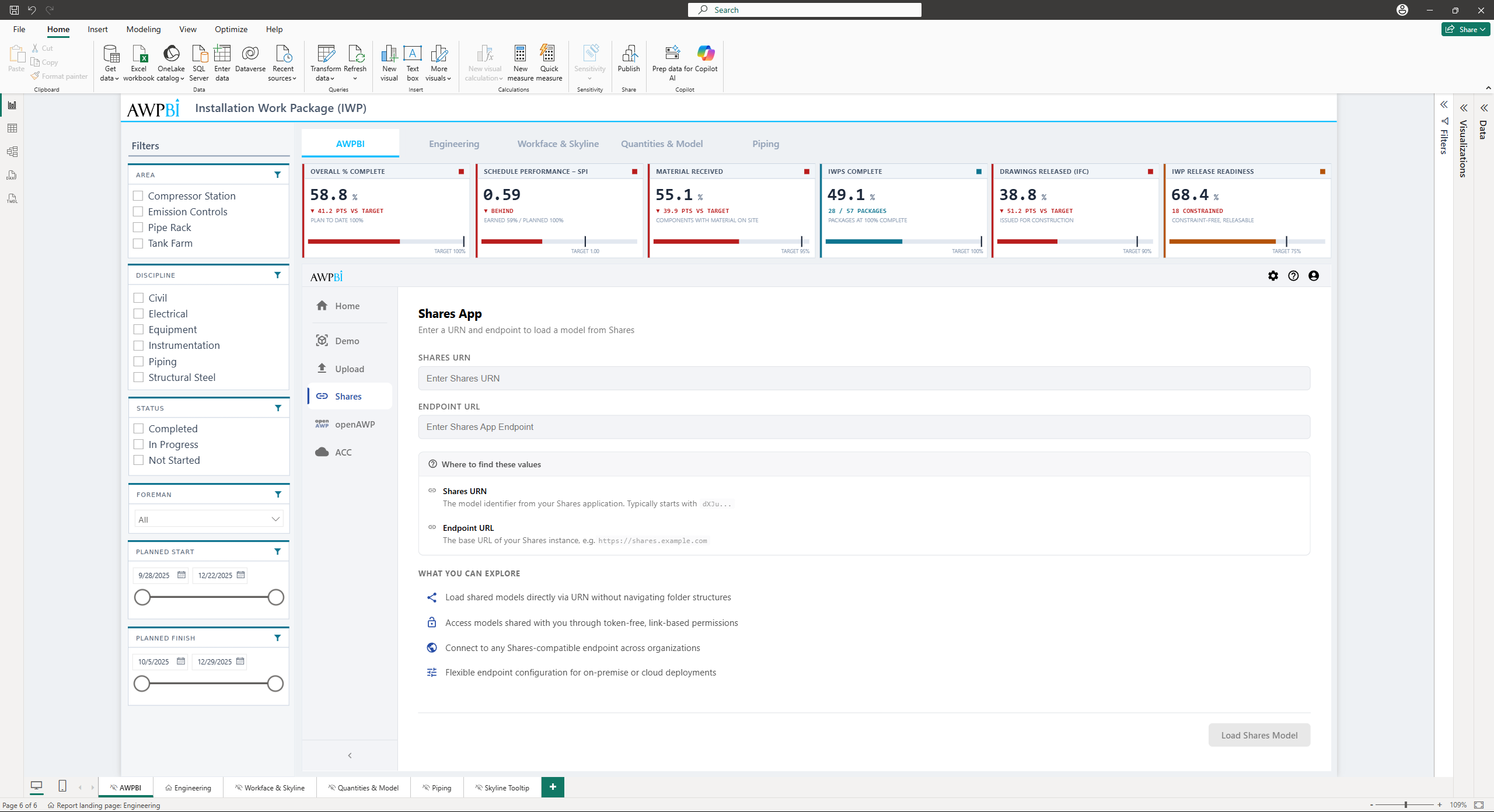
Tip: The Shares URN and endpoint are saved once entered, so the fields pre-fill the next time you open the picker.
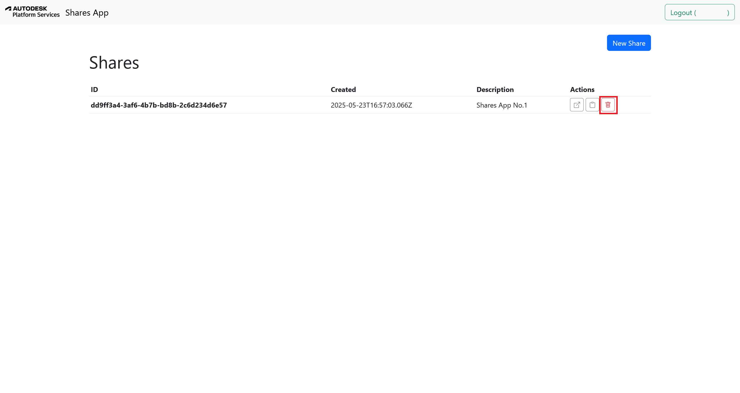
8. Revoke access when needed (optional)
To disable the share, return to the Shares App and click Delete next to the share. The link immediately becomes inactive.
openAWP
Connect your openAWP instance to browse projects and models. Connecting to openAWP also enables the Packaging and Custom Properties panels, which are not available from the other model sources.
Setting up the openAWP connection
1. Enter your instance URL
Open the openAWP tab and enter the address of your openAWP server in the Instance URL field, for example https://your-openawp-instance.com. The URL is saved automatically once entered, so you do not need to retype it next time.
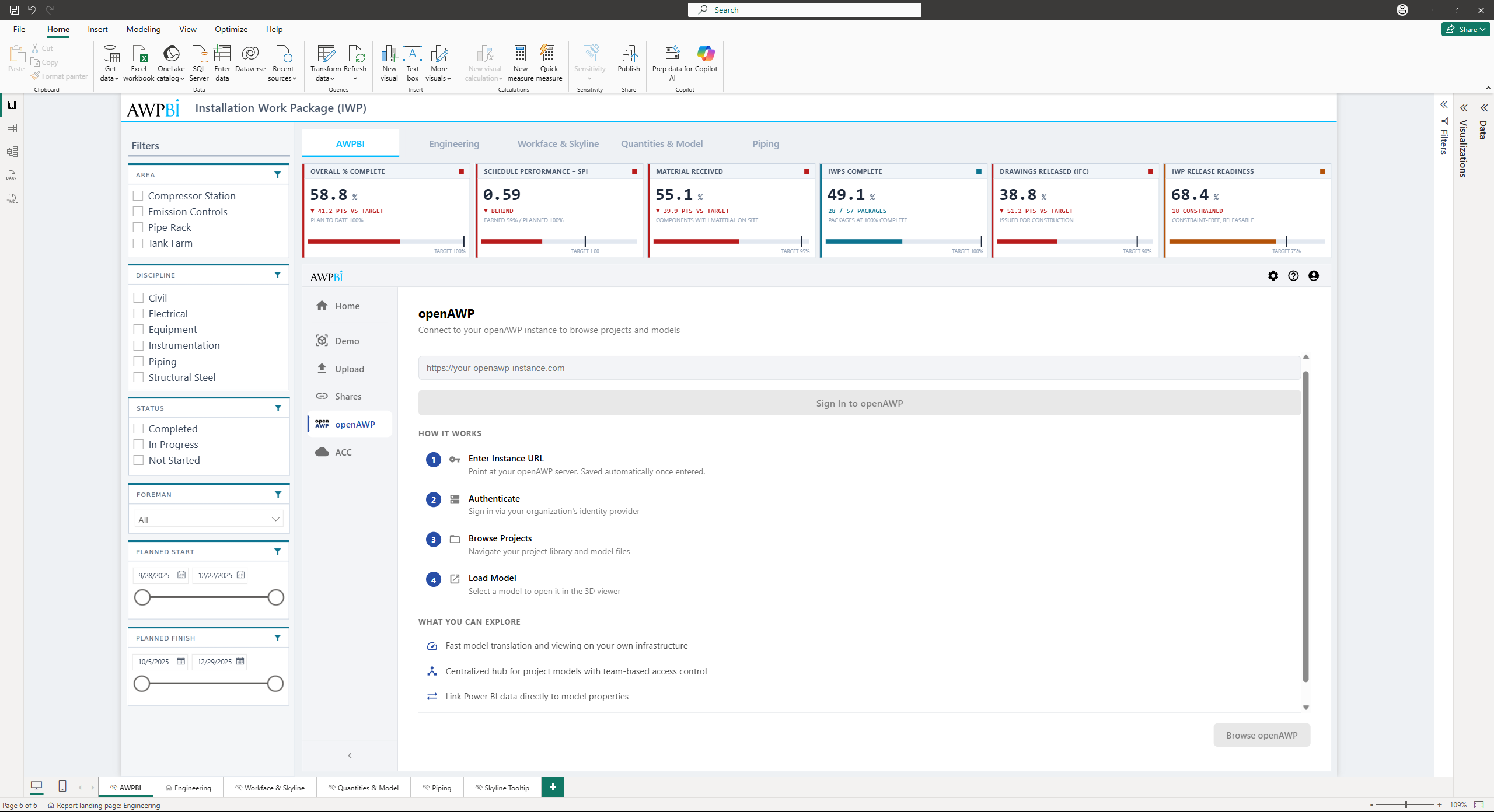
2. Sign in
Click Sign In to openAWP and authenticate through your organization's identity provider. Once signed in, the tab shows a Connected indicator with the signed-in email address and a Sign Out button.
Note: Your openAWP session persists across sessions. The visual automatically refreshes your authentication token.
3. Browse projects
Click Browse openAWP to open your project library. Only projects you have been granted access to appear. Click a project name to select it.
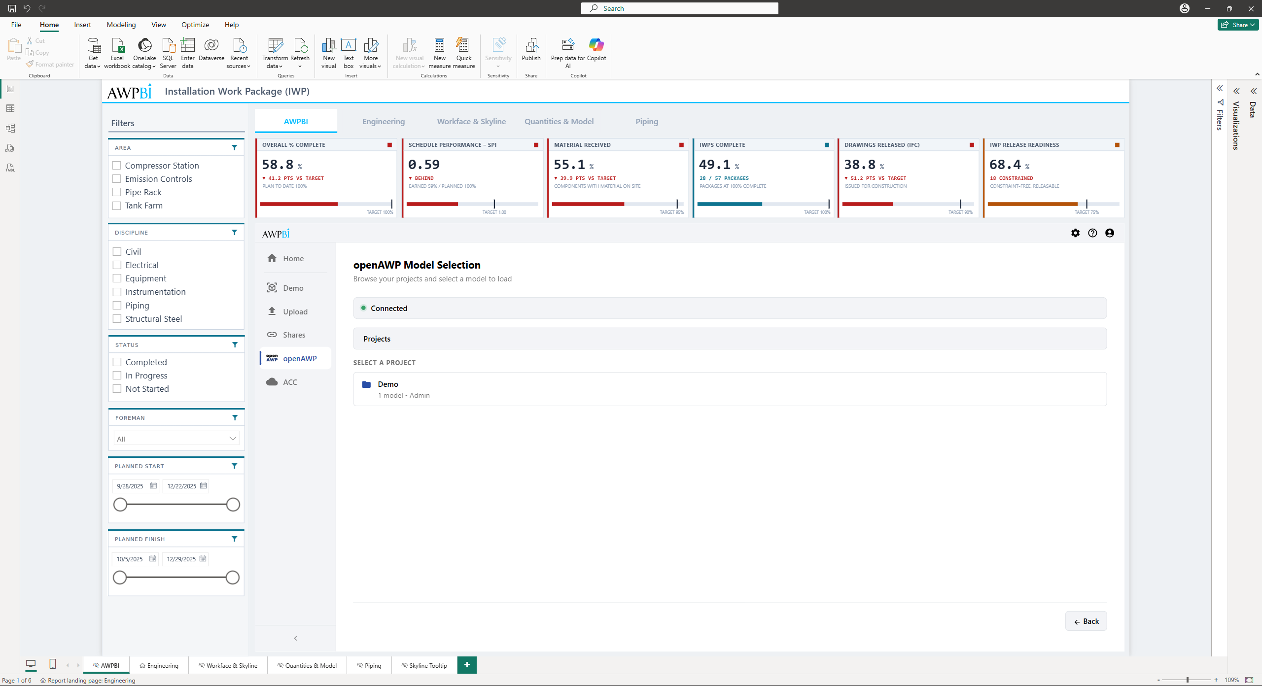
Note: Project access is controlled by your openAWP administrator. If you do not see a project you expect, contact your admin to verify your permissions.
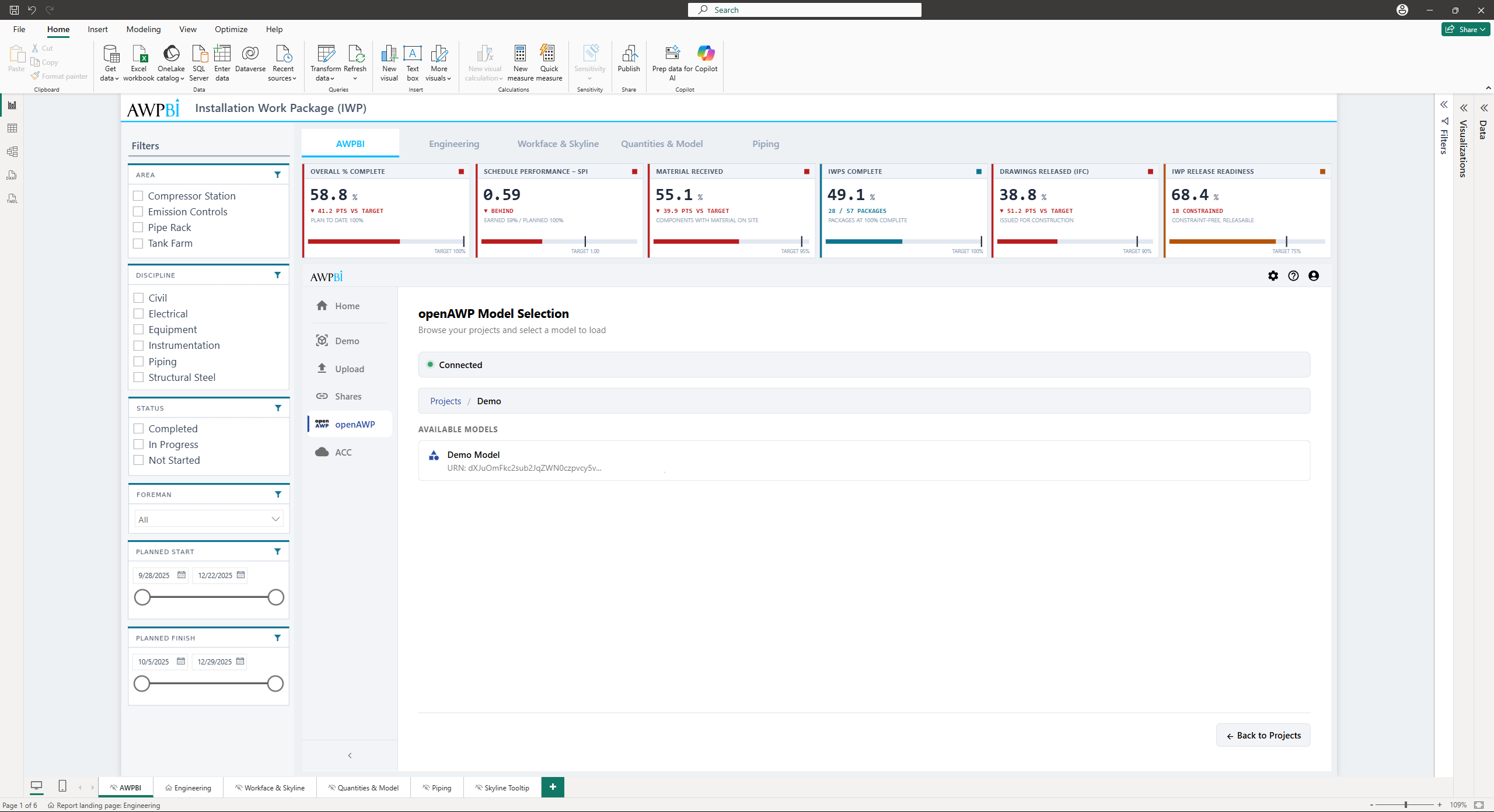
4. Select a model
Only models you have been granted access to appear. Click a model to select it, then confirm to load it into the 3D viewer.
ACC
Sign in to Autodesk Construction Cloud (ACC) and browse your hubs, projects, and folders straight from the visual. You authenticate with your own Autodesk account, and you see the projects it already has access to.
Setting up the ACC connection
Provisioning access
An account or project admin must provision access by adding the following Client ID to the ACC Admin interface:
9EouduzXgCqG1Pyu4tOiiDCX2LoMinUNUthK1DyfjiEh5Lix
1A. Open ACC Admin
Navigate to Account Admin > Custom Integrations > Add custom integration.
2A. Add the Client ID and Application Name
Click Add Custom Integration, paste the Client ID, assign it a name, then add and confirm.
Tip: The integration name can be anything. What matters is the Client ID.
3. Connect to ACC
Open the ACC tab in the model source picker and start the connection.
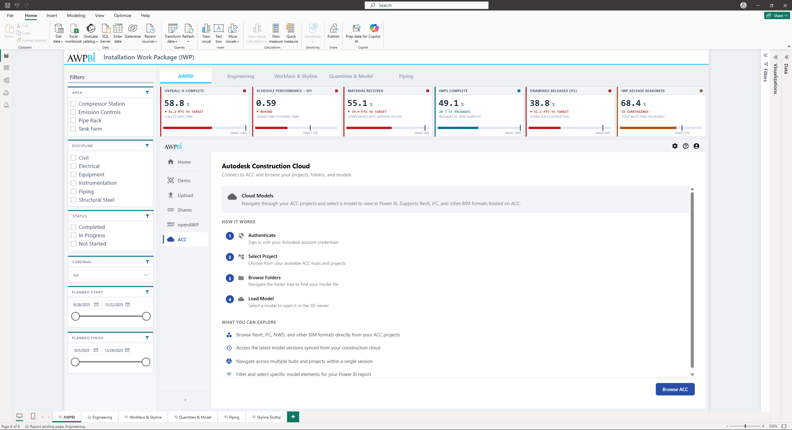
4. Sign in and authorize access
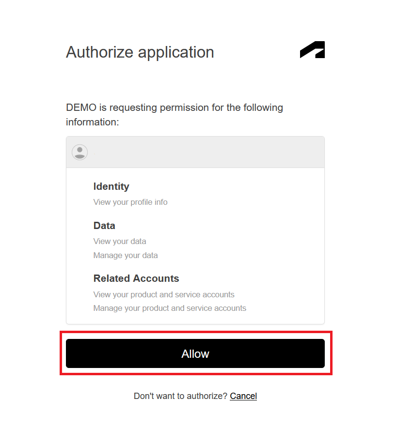
A browser tab opens. Sign in with your Autodesk credentials and click Allow to grant access.
5. Browse and load a model
Once authenticated, return to Power BI to browse your ACC hubs, projects, and folders, then select a model to load.
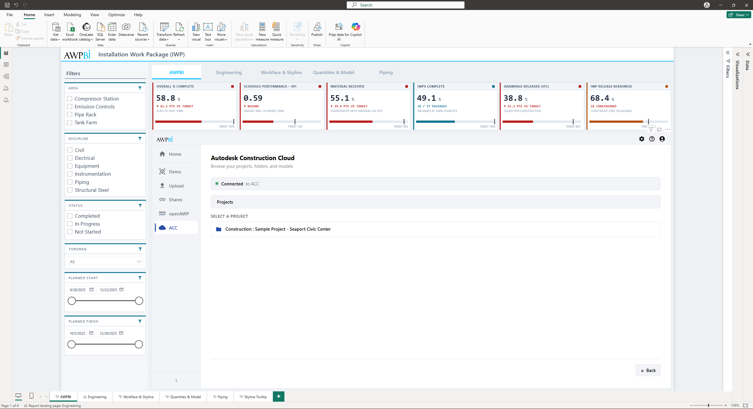
Note: Only projects you have been granted access to appear. Only models within provisioned scopes are loadable.
Toolbar
The viewer toolbar holds every control in three tabs: Main, Tools, and Settings. It reflows to fit the space the visual has on the canvas.
Tip: On short layouts the toolbar collapses automatically. Hover to reveal it, or use the toggle to pin it open. You can also set Collapse Toolbar in the Format pane.
Main Tab
The Main tab covers selection, data export, and the model panels.
View group
| Tool | Function |
|---|---|
| Full Screen / Windowed | Toggle between full-screen and windowed mode. The label reflects the current state |
Data group
| Tool | Function |
|---|---|
| Export | Opens the Export Model Data panel, see Exporting model data |
Selection Tools group
Building a selection, and controlling how the selected objects look.
| Action | Function |
|---|---|
| Select All | Selects every object currently visible |
| Invert | Inverts the current selection |
| Select Same | Pick a property from the popup to select everything else sharing that value |
| Fit | Frames the selection in the camera |
| Highlight | Ghosts everything that is not selected |
| Show Only | Hides everything except the selection |
| Hide Selected | Hides what is selected. Reads Hide All with nothing selected, and Show Hidden once anything is hidden |
| Color | Colors the selection from its Progress/Color value, see Coloring objects |
| Clear | Resets visibility, colors, and ghosting |
Tip: Actions can be combined, for example Fit and Highlight together. Use Clear to reset everything at once.
Tip: You can select individual elements, or hold Ctrl and drag a selection box in the 3D viewer to select multiple objects.
Model Tools group
The model data panels and search tools.
Browser. Opens the native Viewer browser, which lists every object by the model's own instance tree.
- Click a node to select everything inside it
- Use the eye icon to toggle visibility for a whole group
- Type in the search box to filter the tree by name or type
Tip: The Browser shows the model's native structure. To group by any property instead, use Model Hierarchy.
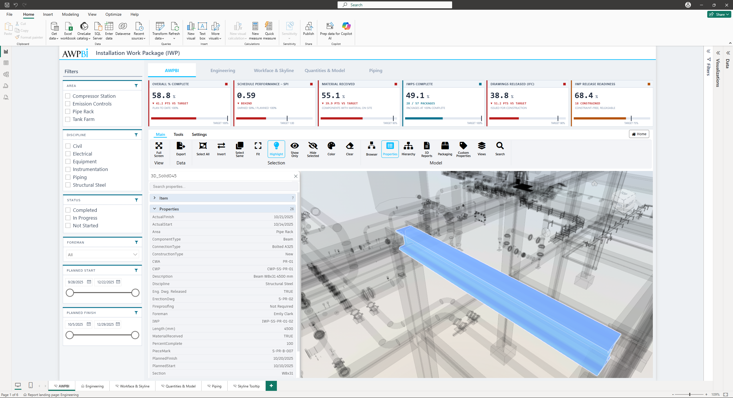
Properties. Opens the Base Properties panel, showing every property on the selected object, grouped into collapsible categories. Search filters by name or value, clicking a value copies it, and the panel follows the selection as it changes. When you are connected to openAWP, its form properties appear here too.
Hierarchy. Opens the Model Hierarchy panel for grouping objects by any property rather than by the instance tree, see Model Hierarchy.
3D Reports. Opens the 3D Reports panel for saving and reusing filter, color, and legend setups, see 3D Reports.
Packaging. Opens the Packaging Tree panel for managing construction packages through openAWP, see Packaging Tree.
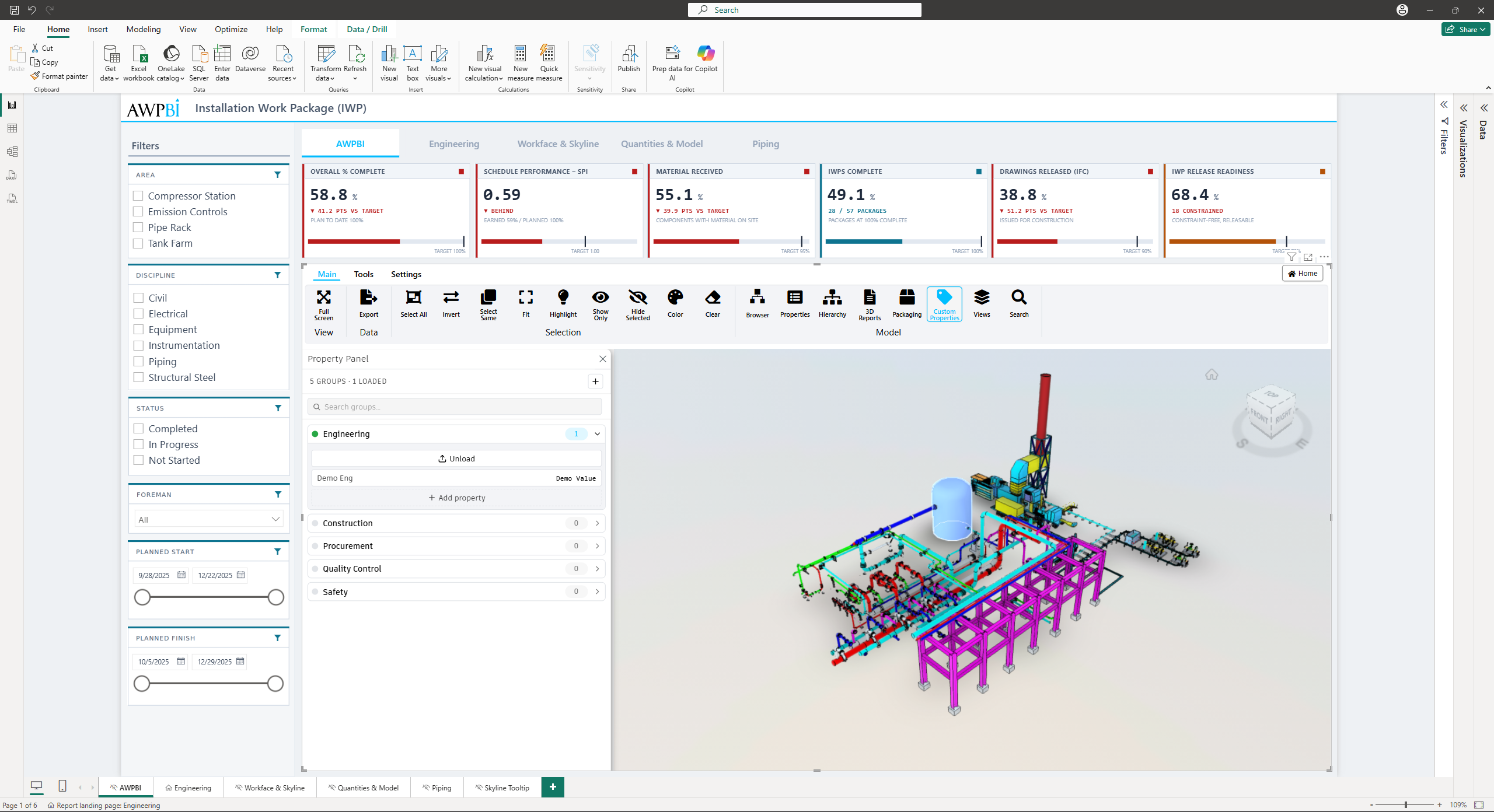
Custom Properties. Opens the Custom Properties panel, which shows the properties defined on your openAWP forms for whatever is selected.
Views. Opens the Saved Views panel for storing and restoring camera positions, see Saved Views.
Search. Opens the Wildcard Search panel for finding objects across all properties, see Wildcard Search.
Note: Packaging and Custom Properties are openAWP features. They appear only when the model was loaded from openAWP or from the demo model, and are hidden for the Shares and ACC sources.
Tools Tab
The Tools tab covers navigation, camera control, measurement, and sectioning.
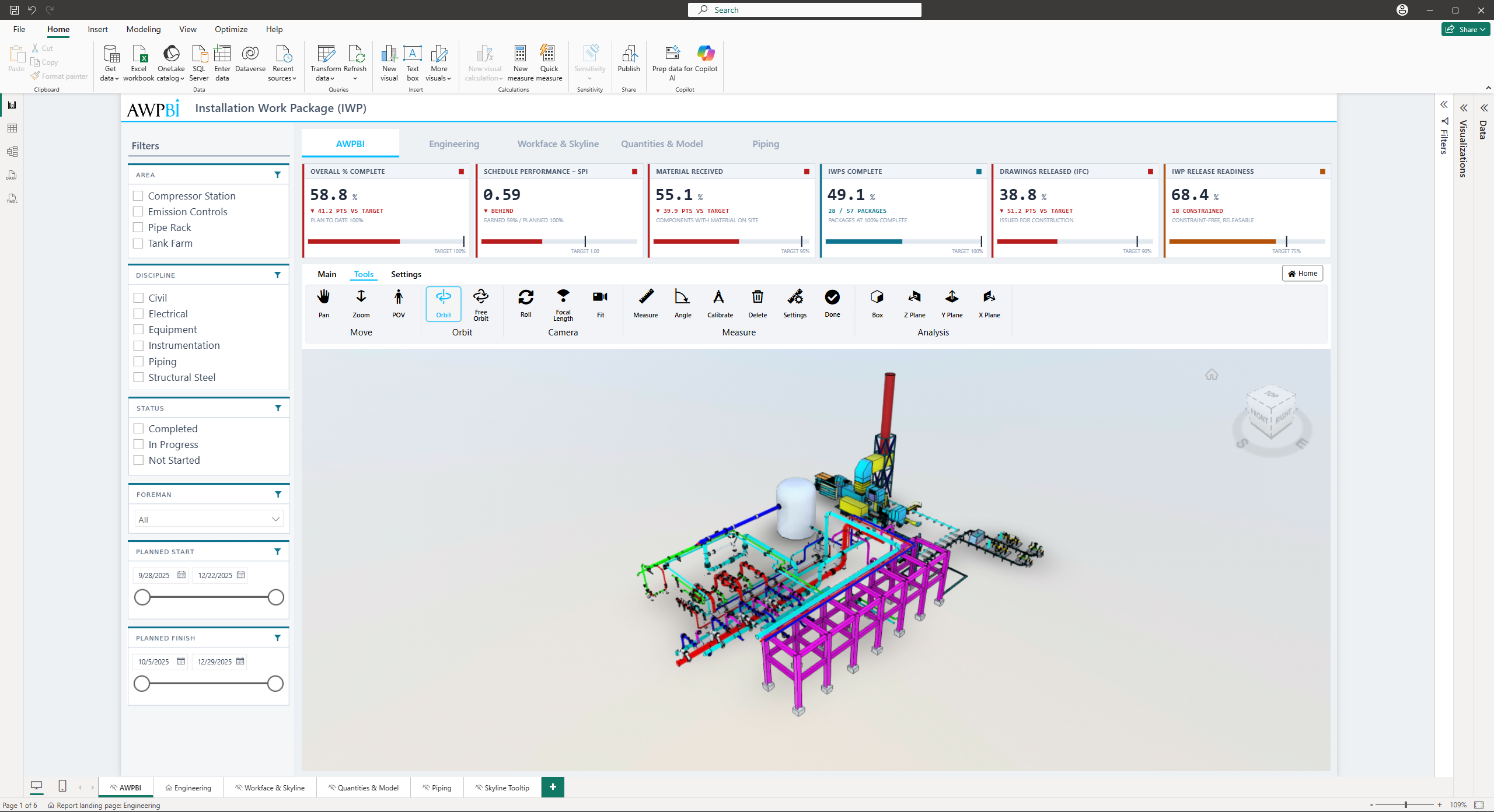
Movement Tools group
| Tool | Function |
|---|---|
| Pan | Drag to move the camera horizontally or vertically |
| Zoom | Drag to zoom in and out, or use the mouse wheel |
| POV | Walk through the model with WASD |
Note: Only one navigation tool is active at a time.
Orbit Tools group
| Tool | Function |
|---|---|
| Orbit | Rotates the camera around the model, keeping the up axis fixed |
| Free Orbit | Rotates in any direction, no constraint |
Camera Tools group
| Tool | Function |
|---|---|
| Roll | Rotates the camera along the view direction, a barrel roll |
| Focal Length | Adjusts the field of view |
| Fit | Frames the whole model |
Measure Tools group
| Action | Function |
|---|---|
| Measure | Distance between two points |
| Angle | Angle between three points |
| Calibrate | Sets a known dimension so the model scale is right |
| Delete | Removes the selected measurement |
| Settings | Units, precision, and display options |
| Done | Leaves measurement mode |
Analysis Tools group
Section planes for cutting into the model.
| Tool | Function |
|---|---|
| Box | A six-sided box you can pull in from any face |
| Z Plane | Horizontal cut, for floor plan views |
| Y Plane | Vertical cut along the Y axis |
| X Plane | Vertical cut along the X axis |
Settings Tab
The Settings tab holds viewer preferences, display toggles, and the report interaction settings.
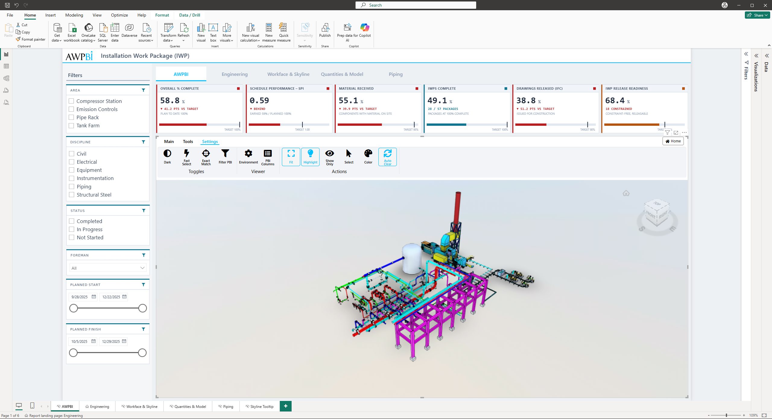
APS Settings group
| Tool | Function |
|---|---|
| Environment | Opens the native APS settings for background, shadows, and performance |
| PBI Columns | Lists the property names this model carries, ready to bind in Power BI |
Tip: PBI Columns is the quickest way to find the exact property name for the Filter values field. Open it before building your data model.
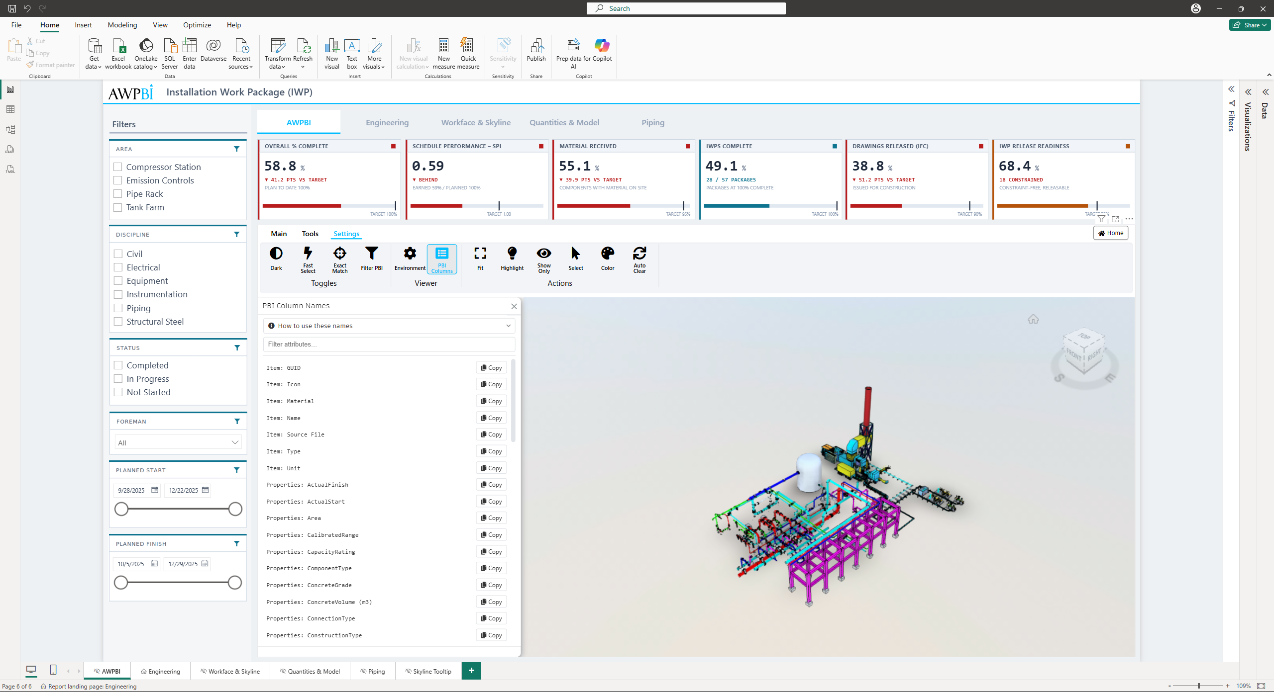
Toggles group
| Tool | Function |
|---|---|
| Light / Dark | Switches the theme. The label names the one you will get |
| Fast Select | Skips the per-object selection highlight. Much faster on large selections, on by default |
| Exact Match | Matches Power BI values exactly against the bound property, falling back to wildcard. Off does a substring search across all properties |
| Filter PBI | Viewer selection filters the Power BI report |
Actions group
What the viewer does when you click data in the report. Turn on as many as you want.
| Action | Function |
|---|---|
| Fit | Fits the camera to the match. On by default |
| Highlight | Ghosts everything that did not match. On by default |
| Show Only | Isolates the match |
| Select | Puts the match into the viewer's selection |
| Color | Colors the match from the Progress/Color field |
| Auto Clear | Clears the previous result first. On by default |
Tip: These six and the Toggles above them also sit in the Generic 3D Settings card in the Format pane, which is where you set the state a report opens in.
Model Panels
The panels below open from the Model or Data group on the Main tab, covered here in detail.
Model Hierarchy
The Hierarchy panel builds a tree from any property you choose. Organize the same model by system, by area, or by anything else the data carries. Nest several properties to drill from one into the next, and toggle a whole branch in or out of view.
Note: Branches with a lot of children load 5,000 at a time. Use Load 5,000 more at the end of the list to pull in the next batch.
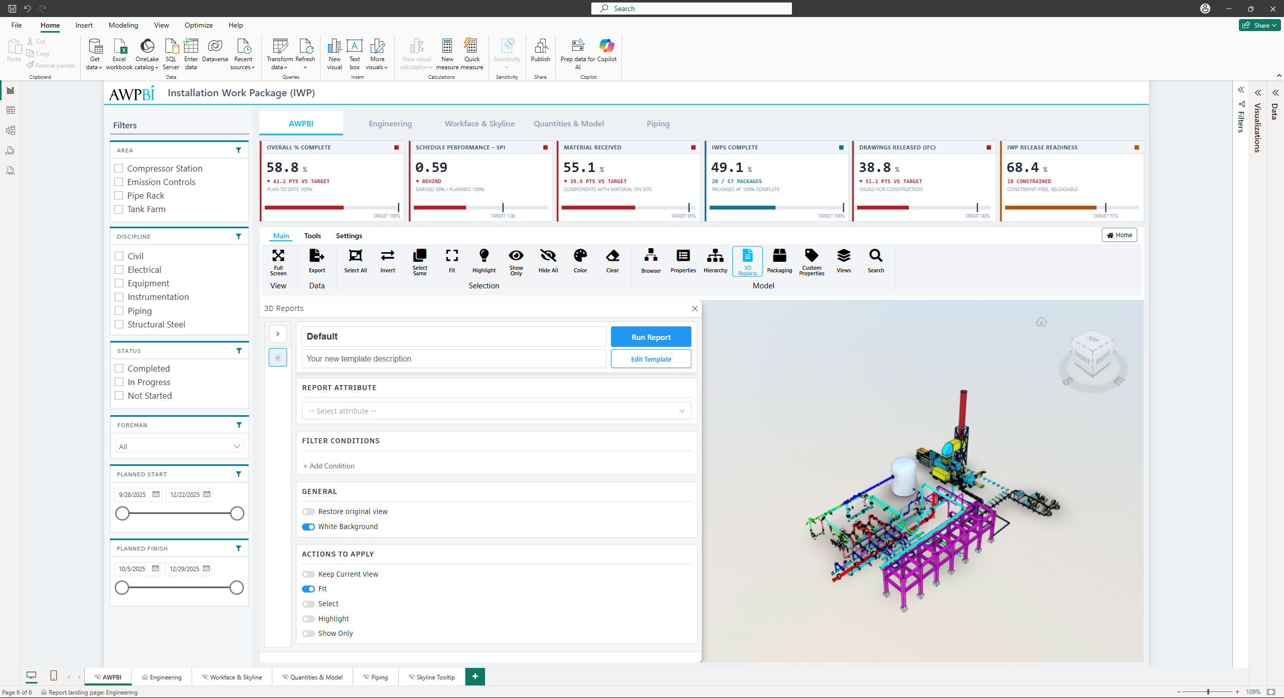
3D Reports
The 3D Reports panel saves a whole visualization setup as a template, so a color-coded view can be reapplied in one click.
A template holds:
- Report Attribute. The model property the report is built around.
- Filter Conditions. Property conditions combined with AND or OR. Click the operator to switch.
- Status Colors. A color per value of the report attribute.
- Legend Attribute and Legend Position. What the legend lists, and where it sits.
- Actions to Apply. Which viewer actions run with it.
Templates are searchable in the panel, and each can be duplicated, edited, or deleted.
Exporting a report to PDF
Use Edit PDF layout to arrange the exported page, then export. The PDF captures the current 3D view along with the report legend.
Saved Views
The Views panel stores camera positions. Add View saves where the camera is now under a name you choose, and clicking a saved view returns to it.
Group related views with Add Folder, which nests as deep as you need. Views and folders can both be renamed and deleted, and the search box filters by name.
Note: Deleting a folder deletes the views inside it, and anything in its subfolders.
Wildcard Search
The Search panel matches a term against every property on the model, wildcards included.
Results come back grouped by property, for example Category, Family, and Type, with each distinct value listed underneath and a count of how many objects carry it. Tick the combinations you want, and whatever actions you have turned on apply to the result.
Packaging Tree
The Packaging panel manages construction packages through openAWP. Packages follow the forms defined there, and you build them up by selecting objects in the viewer and assigning them.
Create packages and add or remove components from the panel. Your openAWP permissions decide what you can change, and read-only access shows the tree without the editing controls.
Note: Packaging is an openAWP feature. It appears only when the model was loaded from openAWP or from the demo model, and is hidden for the Shares and ACC sources.
Exporting model data
The Export Model Data panel exports element properties as a CSV file, taken directly from the model in the viewer.
1. Open the panel
On the Main tab, in the Data group, click Export.
2. Choose attributes
The panel reads every attribute defined on the model and groups them by category. You do not need a selection yet. Use the search box to filter by attribute or category name, expand a category to see what is in it, and tick the ones you want. Select All takes everything, and a separate toggle adds a UID column.
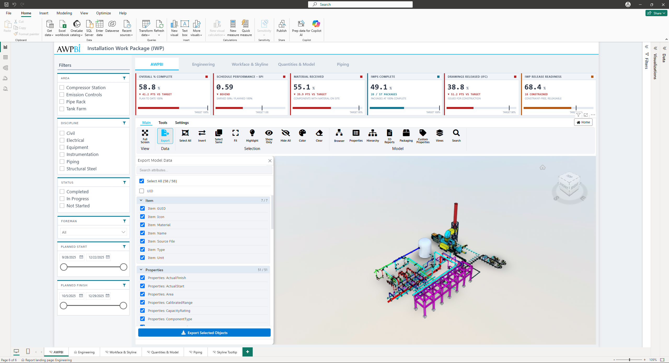
3. Select objects and export
Select the objects you want in the viewer, then export. The file downloads as model_export_2026-08-05_14-30-22.csv, stamped with the date and time of the export.
Each selected object becomes one row. Properties held on a parent node rather than on the object itself are inherited down, with the nearest node winning.
Note: Rows carrying identical values across every exported attribute collapse into one. The file holds one row per distinct combination.
Note: Selecting 25,000 objects or more prompts for confirmation first. An export that size can take several minutes or crash the visual. There is no hard limit once you confirm.
Tip: The file is UTF-8 with a byte order mark. Values starting with =,
+, -, or @ get a leading apostrophe, which affects negative numbers.
Filtering
Filtering works both ways between the report and the model.
From model to report. Select objects in the viewer and the report narrows to their rows. Everything unrelated drops out until you clear the selection.
From report to model. Click a row or cell in the report and the matching objects respond in the viewer, according to the actions you have turned on.
Getting Started with Filtering
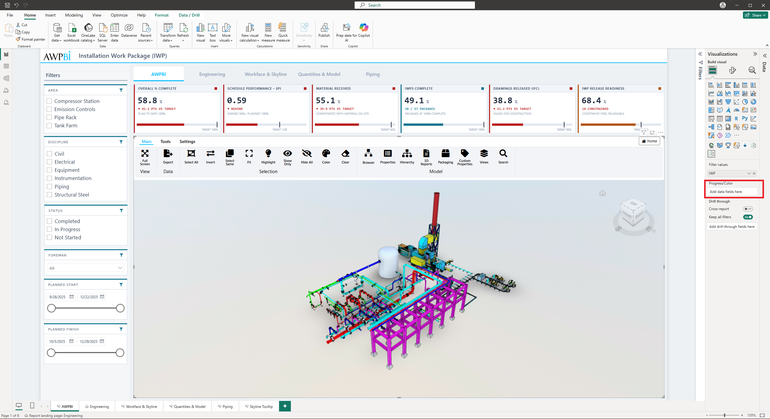
Before using the filtering features, populate the data fields in the visual's data wells. The visual accepts two fields:
| Field | Purpose |
|---|---|
| Filter values | The property values used to match report rows to model objects. Required for filtering |
| Progress/Color | The values used to color objects, see Coloring objects |
Populating data wells
- Select the 3D for Power BI visual in your report.
- In the Visualizations pane, locate the Build visual section.
- From your data model in the Data pane, drag and drop fields into the appropriate data wells.
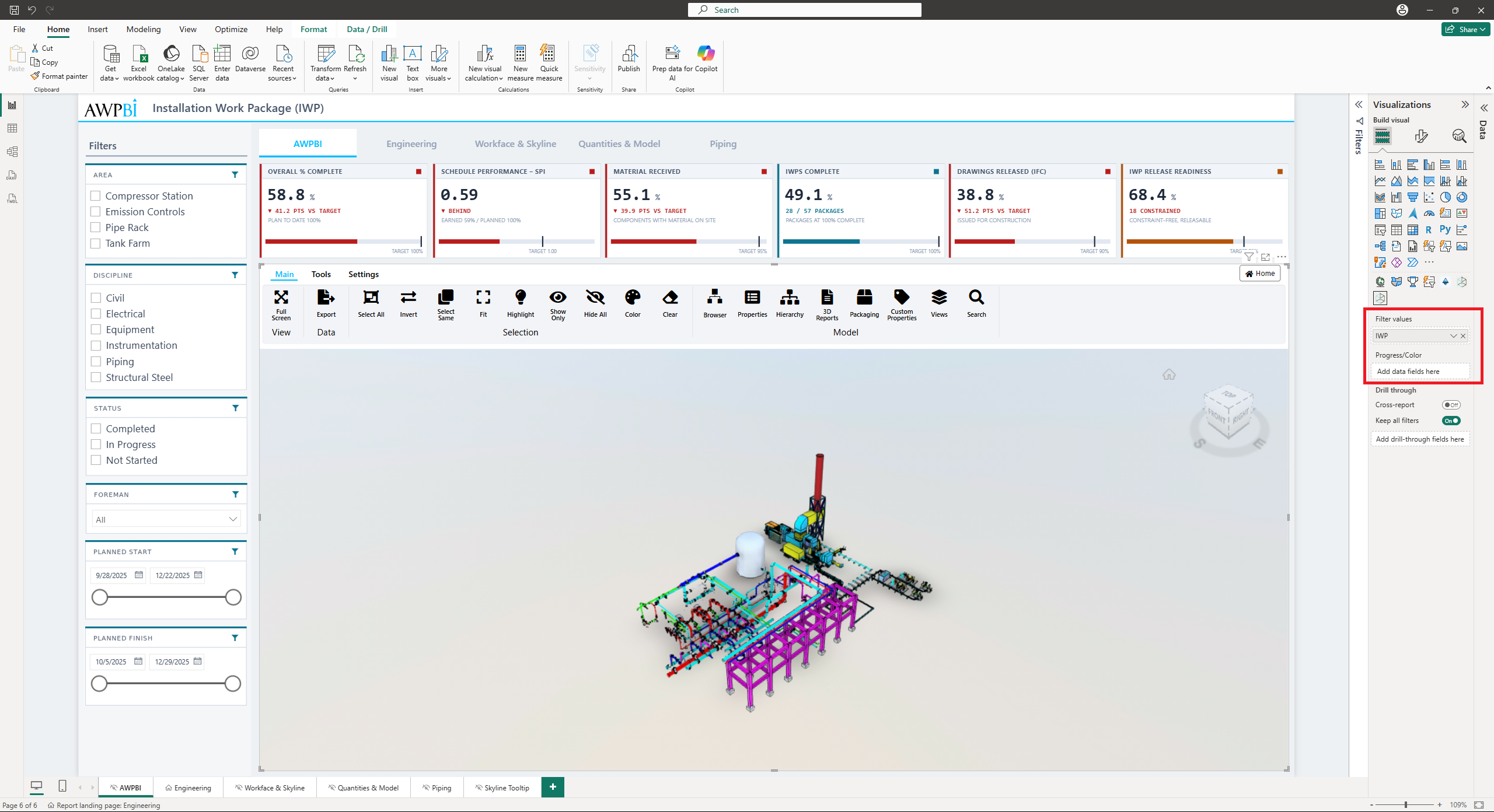
Note: Only the Filter values data well is required for filtering functionality.
Tip: Bind at least one field before configuring anything else. Power BI does not persist a visual's saved settings, including 3D report templates and saved views, until the visual has a bound data field.
Getting Started with Report Filtering
1. Select model elements
Select the relevant objects within the 3D model to filter the data.
Tip: Hold Ctrl and drag a selection box in the 3D viewer to select multiple objects at once.
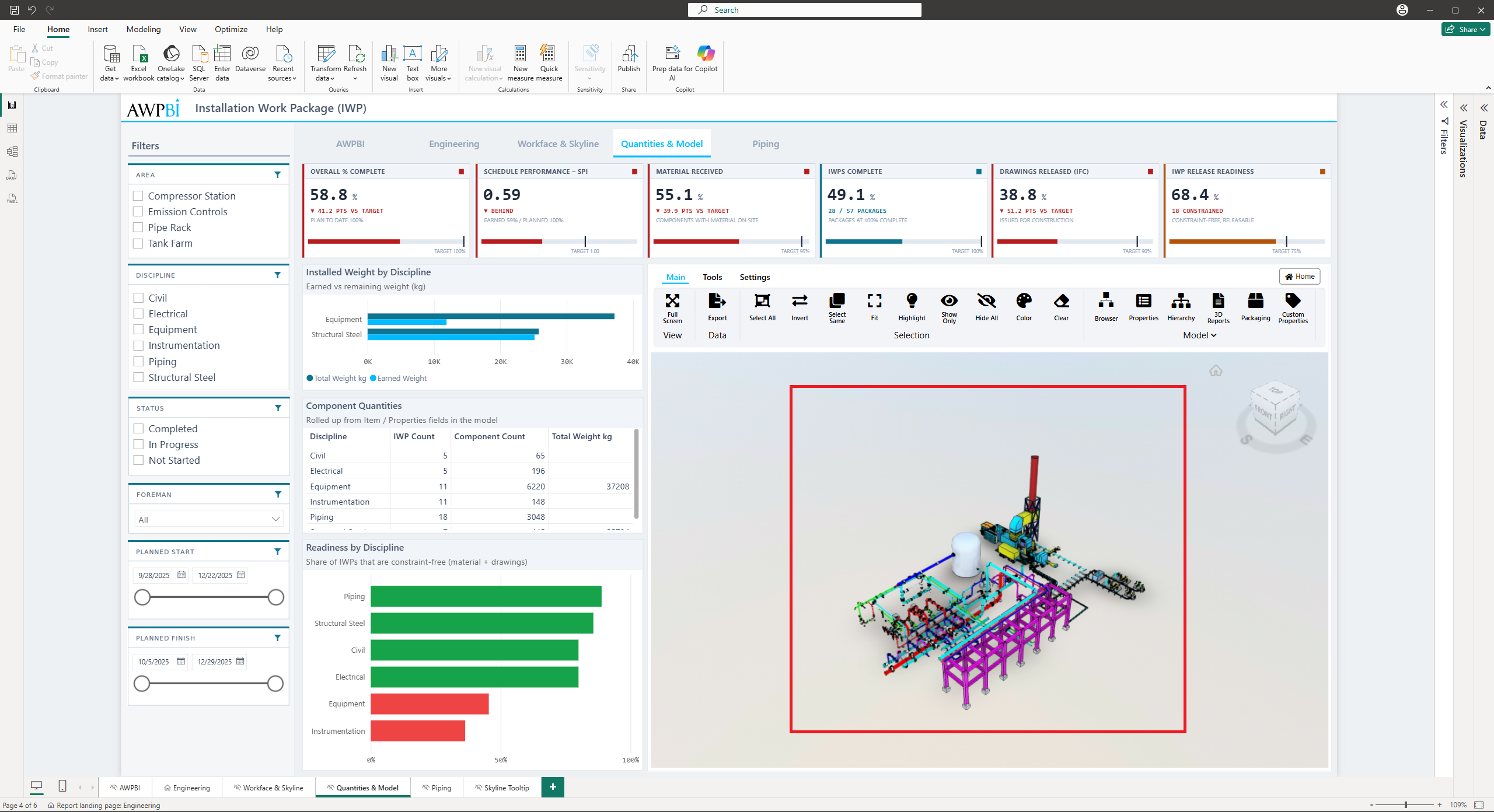
2. View filtered results
The report visuals update to display only the data associated with the selected objects. Unrelated data is temporarily excluded.
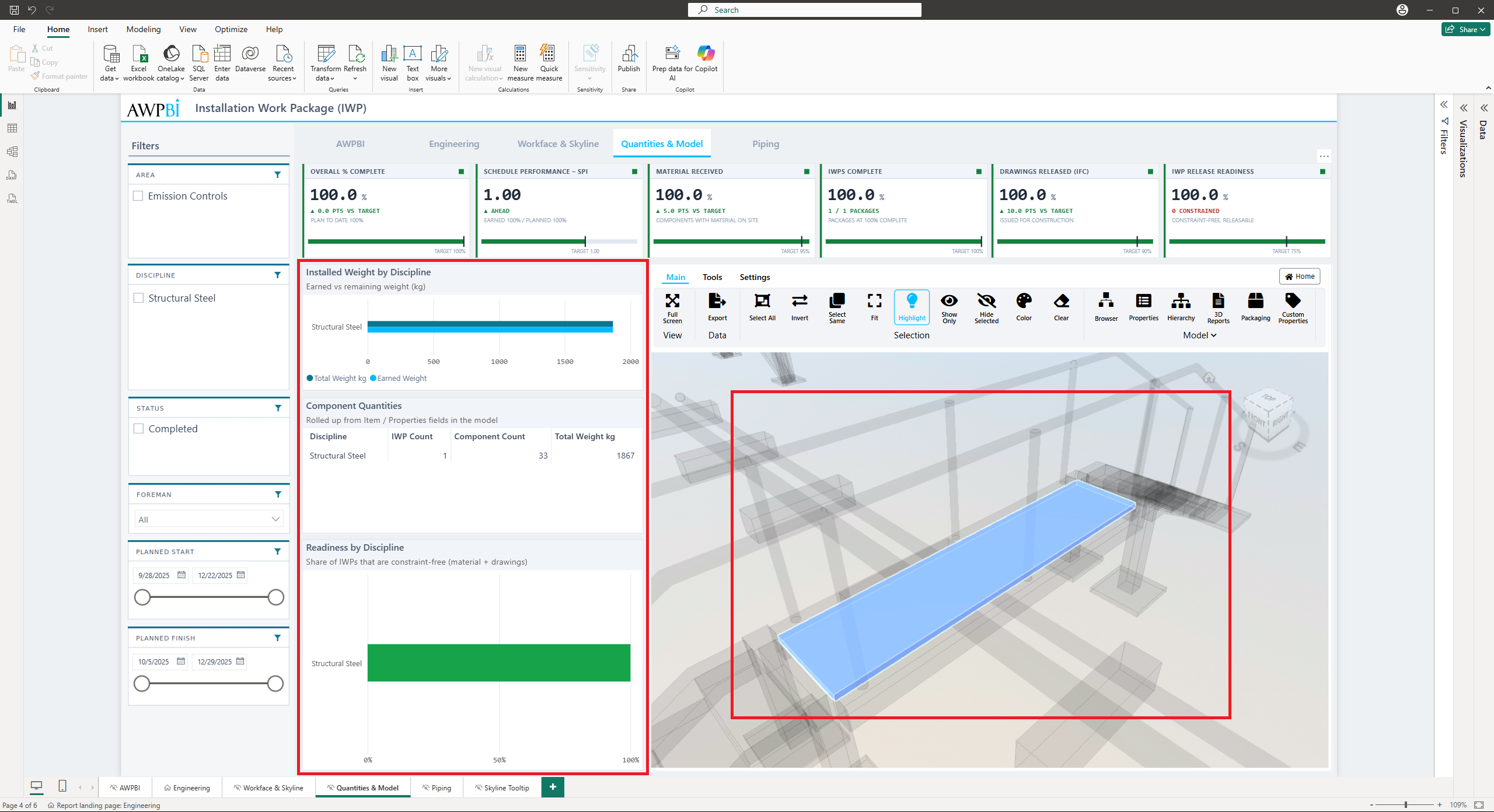
Tip: If viewer selection should not filter the report, turn off Filter PBI on the Settings tab.
Getting Started with Model Filtering
1. Open the Settings tab in the viewer
In the 3D viewer, navigate to the Settings tab. In the Actions group, click to apply one or more filtering actions:
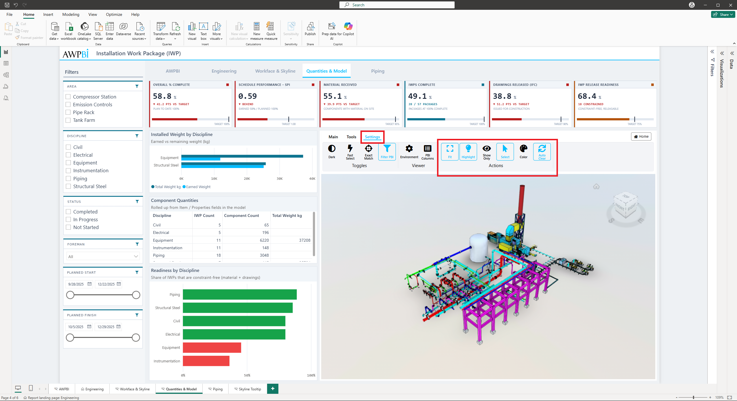
- Highlight
- Show Only
- Select
- Fit
- Color, see Coloring objects
Tip: You can apply multiple actions at the same time to create a customized filtering setup.
2. Interact with the report to apply filters
Click a data cell or row within the Power BI report to trigger filtering actions in the 3D model. The selected operations, such as Select, Show Only, or Fit, are applied to the corresponding objects.
Tip: Hold Ctrl and click each desired row or cell to apply filters to multiple items at once.
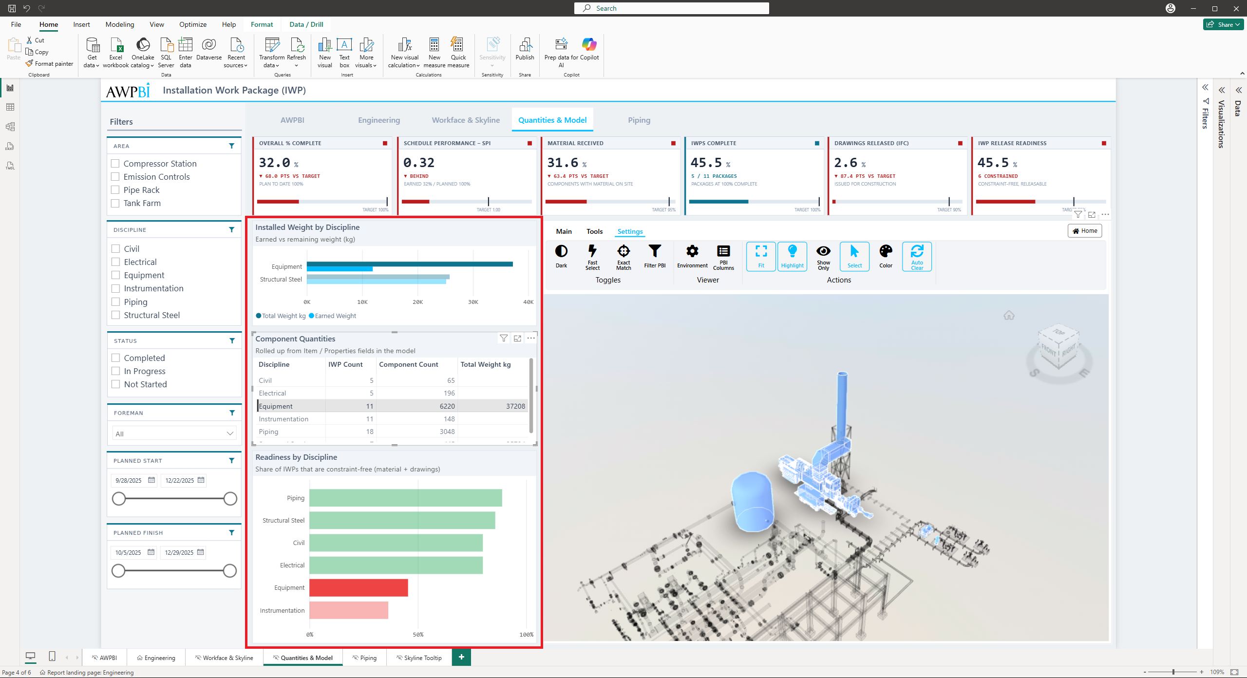
Filtering in Action
Report filtering
Selecting objects in the 3D model filters the Power BI report to show only the linked data.
Model filtering
Selecting rows or cells in the Power BI report triggers visual responses in the 3D model. Multiple selections are supported.
Highlight. Emphasizes the objects linked to the selected report data.
- Effect: the matching objects are drawn in the highlight style. Nothing is hidden or moved.
- Use case: picking out key components while keeping the rest of the model in view.
Show Only. Isolates the matched objects.
- Effect: everything else is hidden until you clear the filter.
- Use case: cutting a large model down to one discipline or one problem area.
Select. Selects the objects linked to the chosen data rows.
- Effect: the matching objects enter the viewer's selection, so the selection tools and the Properties panel act on them.
- Use case: cross-referencing a row against the geometry it describes.
Fit. Moves the camera to the matched objects.
- Effect: the view reframes so the matches fill the canvas, however far apart they are.
- Use case: finding where in a large model a given row actually lives.
Color. Shades the matched objects by their Progress/Color value.
- Effect: each object takes the color you mapped to its value in the Format pane, see Coloring objects.
- Use case: showing construction or installation progress in the model itself.
Colors and Appearance
Both settings below live in the Power BI Format pane rather than the viewer toolbar.
Coloring objects
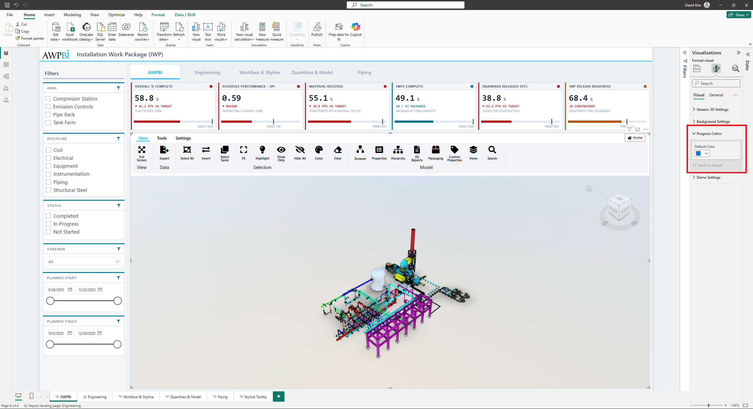
Object color comes from the column you bind to the Progress/Color data well. You pick the colors in the Progress Colors card.
The card reshapes itself around the column you bind:
- Text values. One color picker per distinct value, up to 20. Status values such as
Not Started,In Progress, andCompleteget their colors here, and you pick every one of them. - Numbers. The pickers relabel to eleven percentage bands:
0%, then1% - 10%through91% - 100%. - Hex codes. The per-value pickers disappear. The column already carries the colors.
Individual values resolve in this order:
- A hex code. A value such as
#FFA500is used as-is. - A value with a picker. Whatever you chose for it in the card.
- A number. Falls into its percentage band. A trailing percent sign is fine, so
75and75%behave the same. - A named color. Around fifty names are recognized, including
blue,lavender, andturquoise.
Anything left over takes the Default Color from the top of the card. That picker also does the work on its own when nothing is bound to Progress/Color, painting every target object one color.
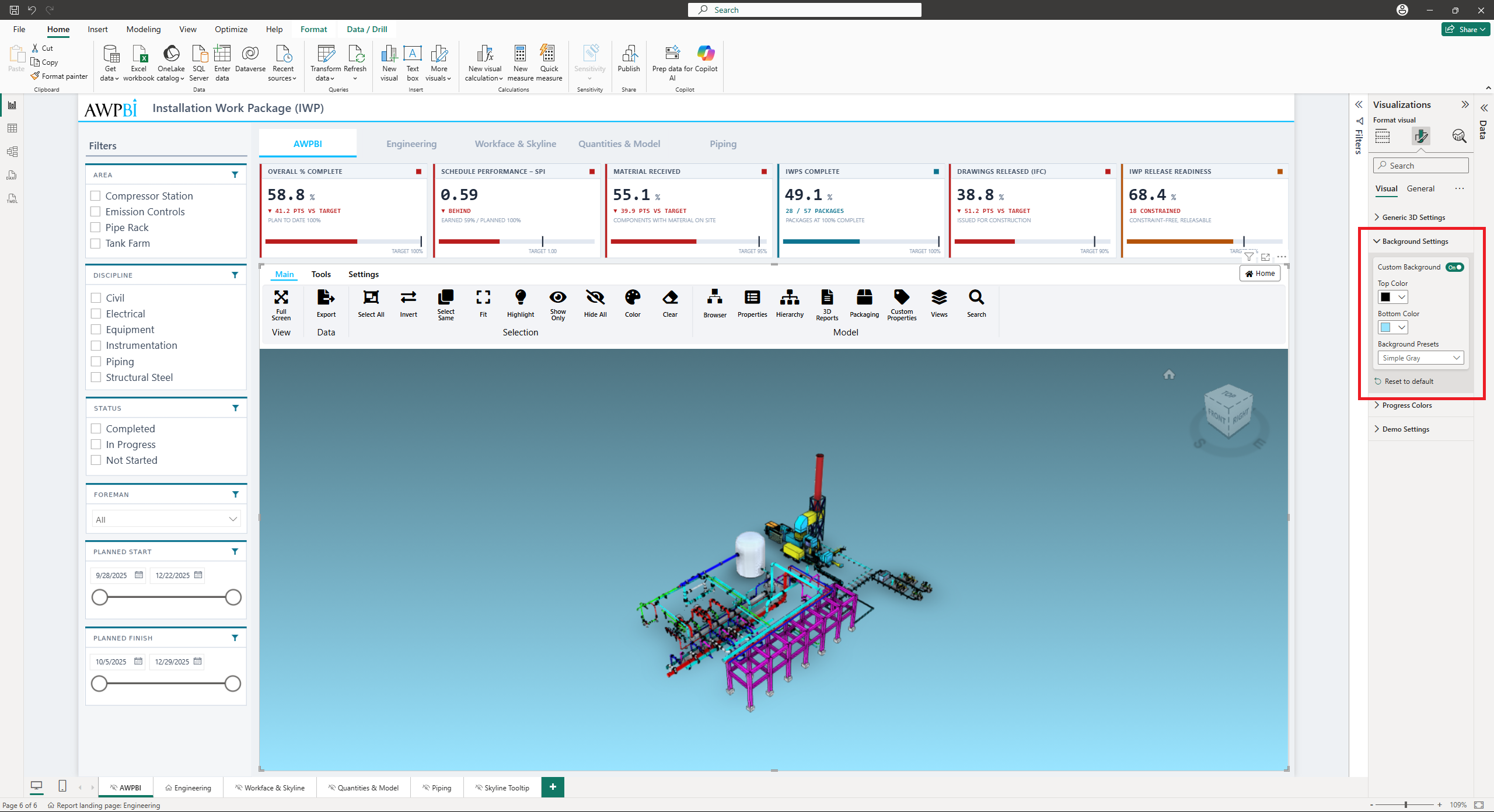
Background
The Background Settings card controls the viewer backdrop. Choose one of the built-in environment presets, or turn on Custom Background and set your own top and bottom colors for a gradient.