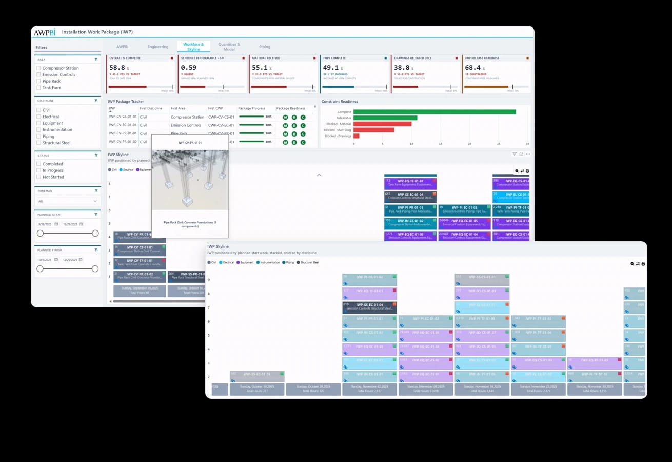
A free Power BI custom visual that stacks your work packages into columns by planned date: one cell per package, colored by your legend field. Built by AWP practitioners, free on Microsoft AppSource.
The visual costs nothing. If you want the dashboard around it built for you, we price the engagement.
The full visual, on Microsoft AppSource, with every feature included.
Every package renders as a cell, stacked into date columns along the axis. Quantity and timing read at a glance: heavy weeks stand tall, thin weeks stand out.
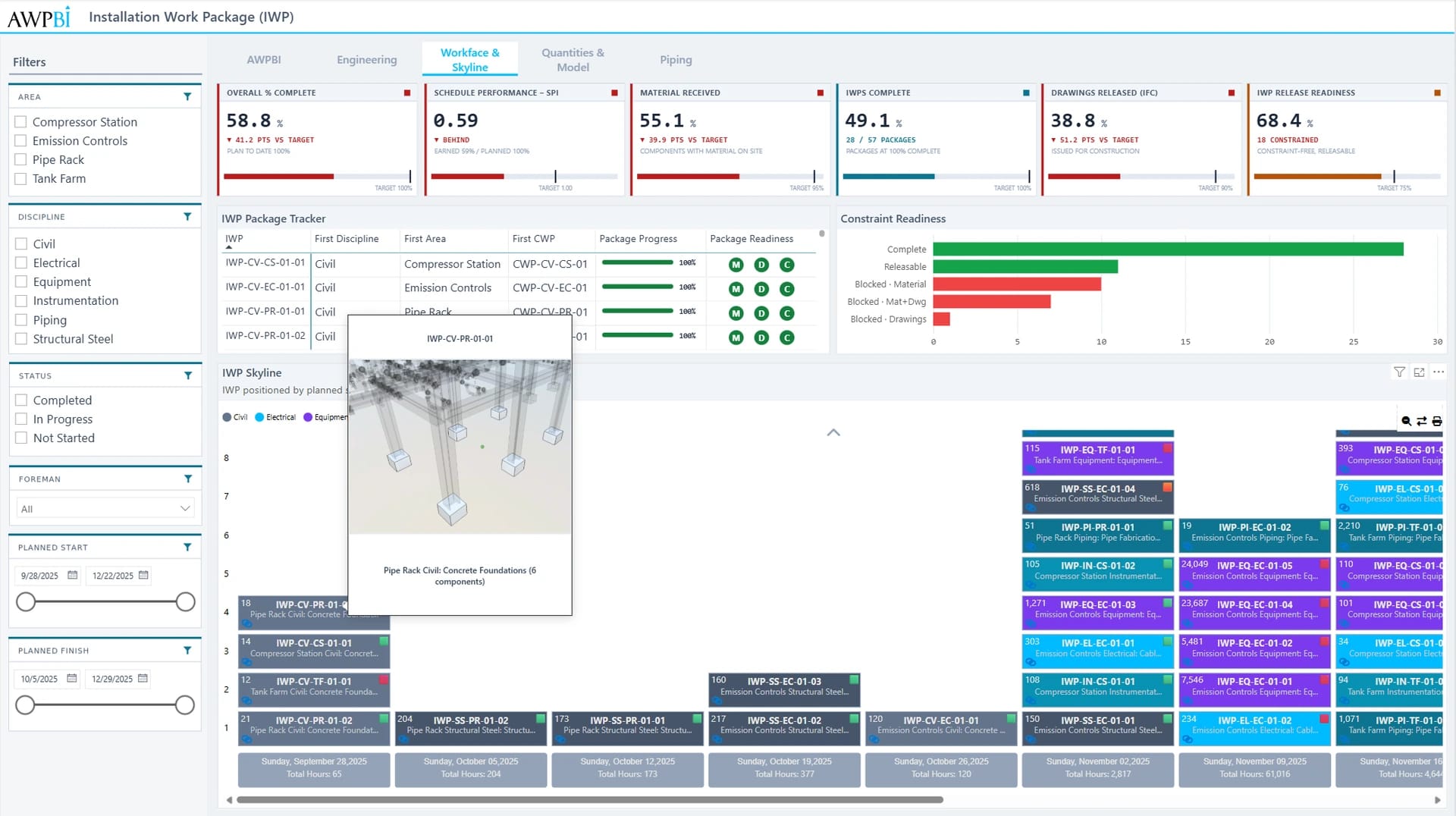
Selecting cells cross-filters every other visual on the page, and a right-click drills through to a page filtered to that package. A URL field puts a link icon in each cell that opens the package document.
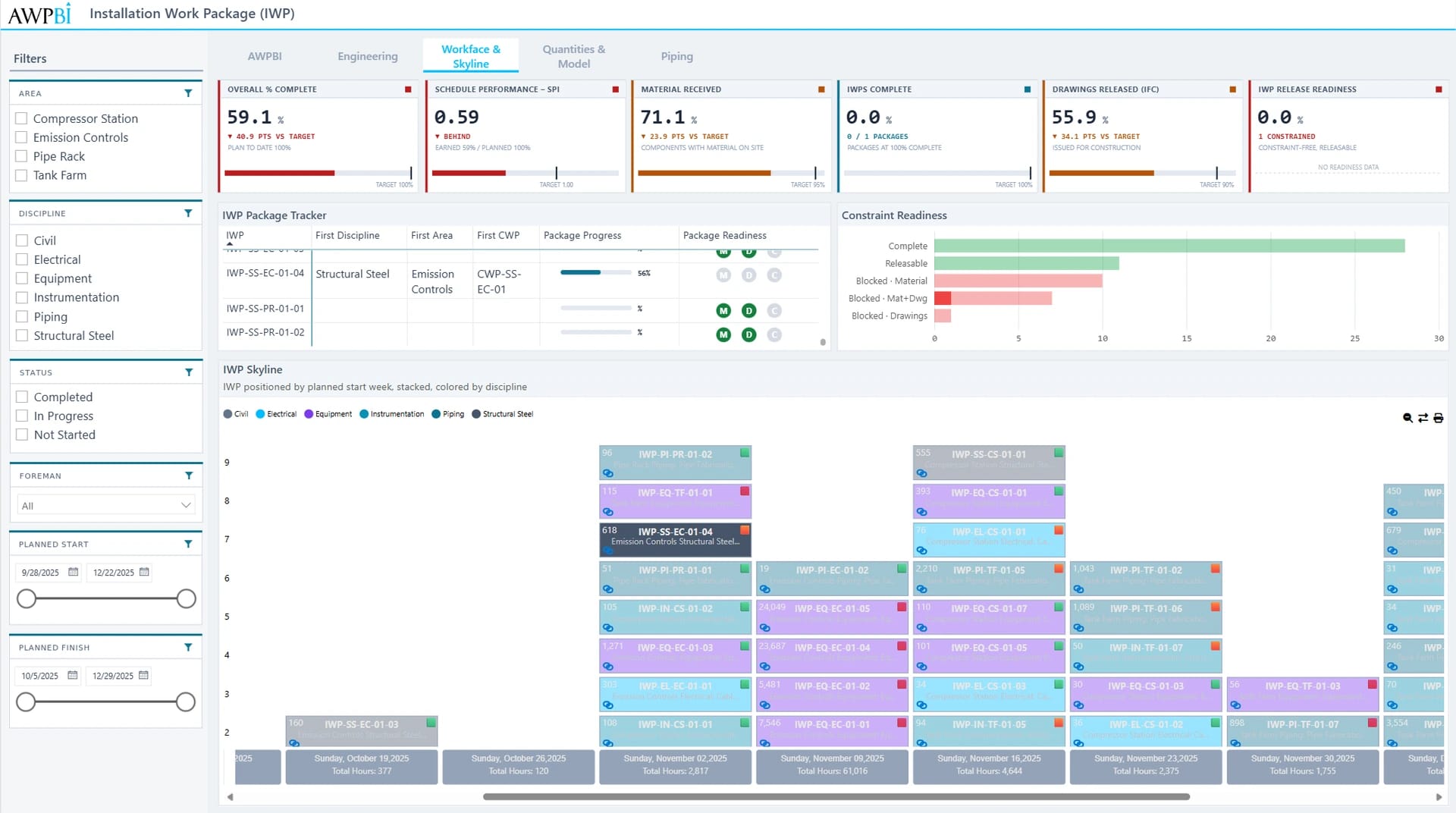
Group the axis by day, week, or month, with custom date formats.
Cells carry the package ID, a description line, and a planned value.
Color cells by status or discipline, with up to 10 editable colors.
Show planned hours per cell as sum, average, min, max, median, or count.
Flip cells to show three more fields, one cell at a time or all at once.
Cell selections filter the report; right-click drills to a detail page.
Add a URL field and each cell shows a link icon that opens that package's URL.
Hover any cell for tooltips carrying key attributes or model previews.
Turn on the print button and put the skyline on paper for the field.
Skyline renders whatever your report's data model holds. Feed it planned dates from Primavera P6 and package data from openAWP through the Power BI pipeline you already run.
 Power BISkyline renders whatever your report data model holds.
 Primavera P6Feed it planned dates from Primavera P6.
Common in these industries
Read the user guide, or talk to the practitioners who built it.
