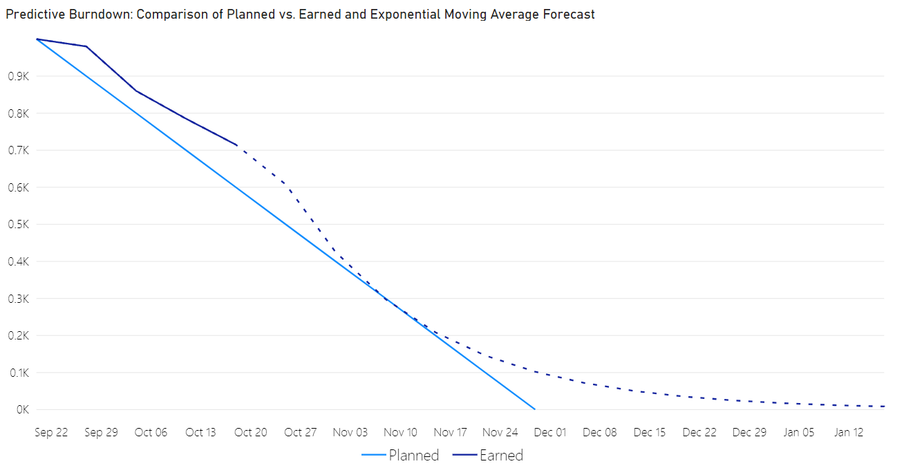
Predictive Burndown plots remaining work over time and forecasts the completion date from the history already in your data. Where a project has no predefined forecast, the visual generates one using a regression or moving average model of your choice.
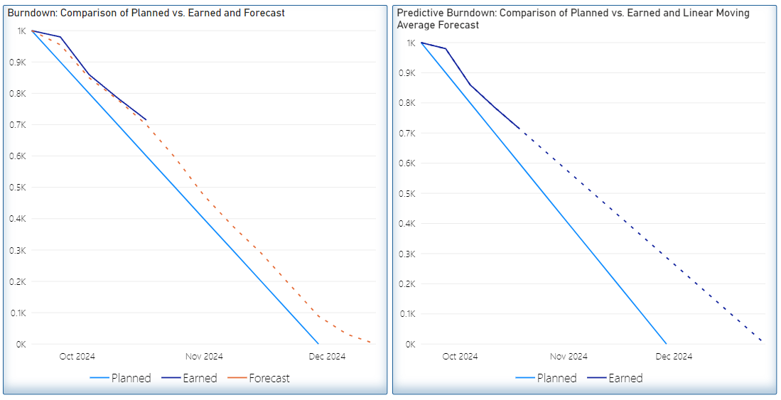
The visual provides:
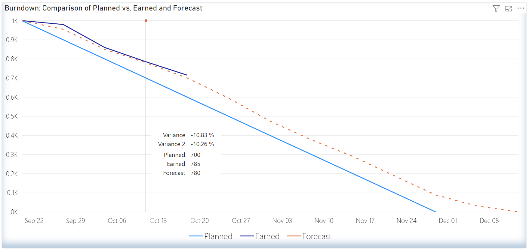
- Baseline, actual, and forecast series plotted on a shared timeline
- Five forecasting models: linear regression, polynomial regression, exponential smoothing, linear moving average, and exponential moving average
- Period or cumulative data display
- Primary and secondary Y axes with independent scale, units, and reference lines
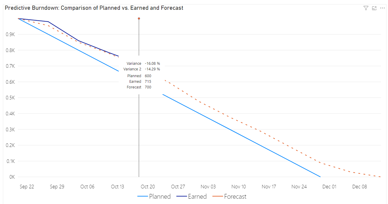
- Tooltips showing the values behind any point on the chart
Getting Started
Access
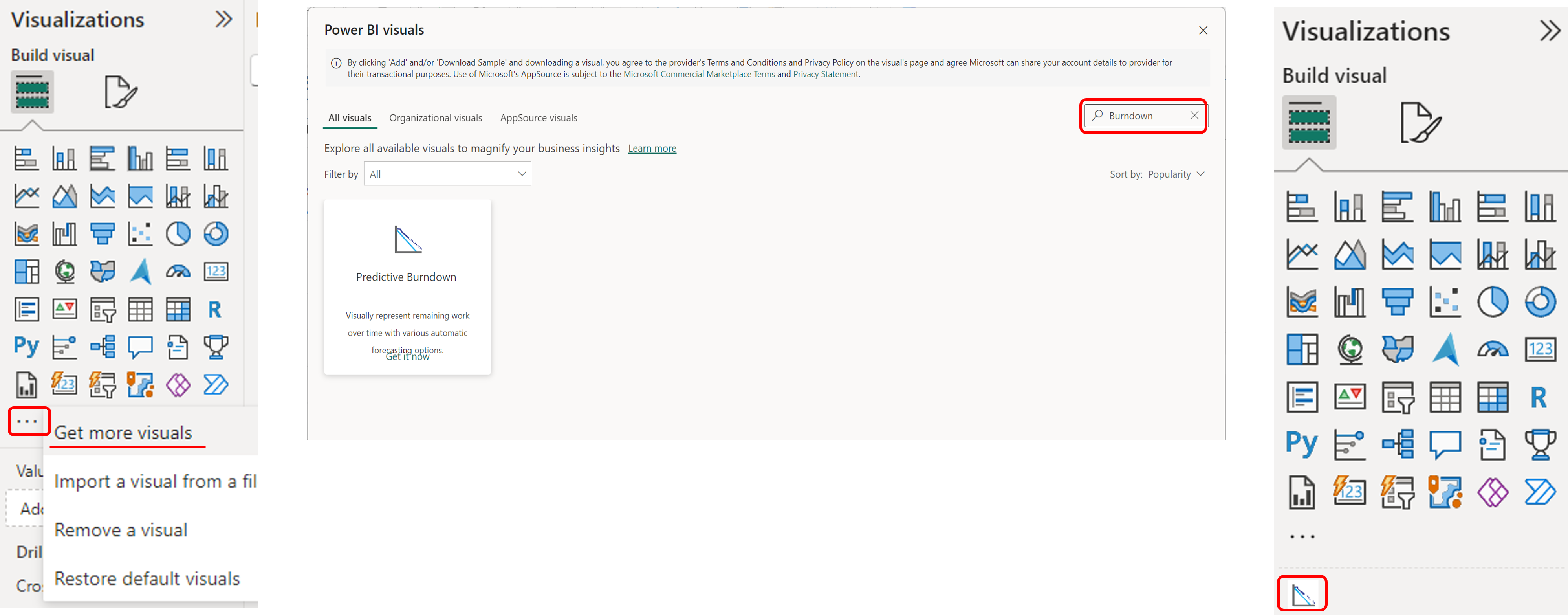
Predictive Burndown is available free of cost in the Power BI marketplace. In the Visualizations pane, click the three dots and select Get more visuals, then search for Predictive Burndown. Select it to view the details and click Add to bring it into your report.
Creating Your First Report
1. Add the visual to the canvas
Select the now available Predictive Burndown visual to place it on your report canvas.
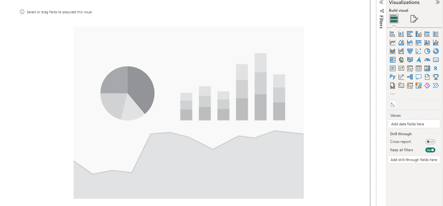
2. Populate the data wells
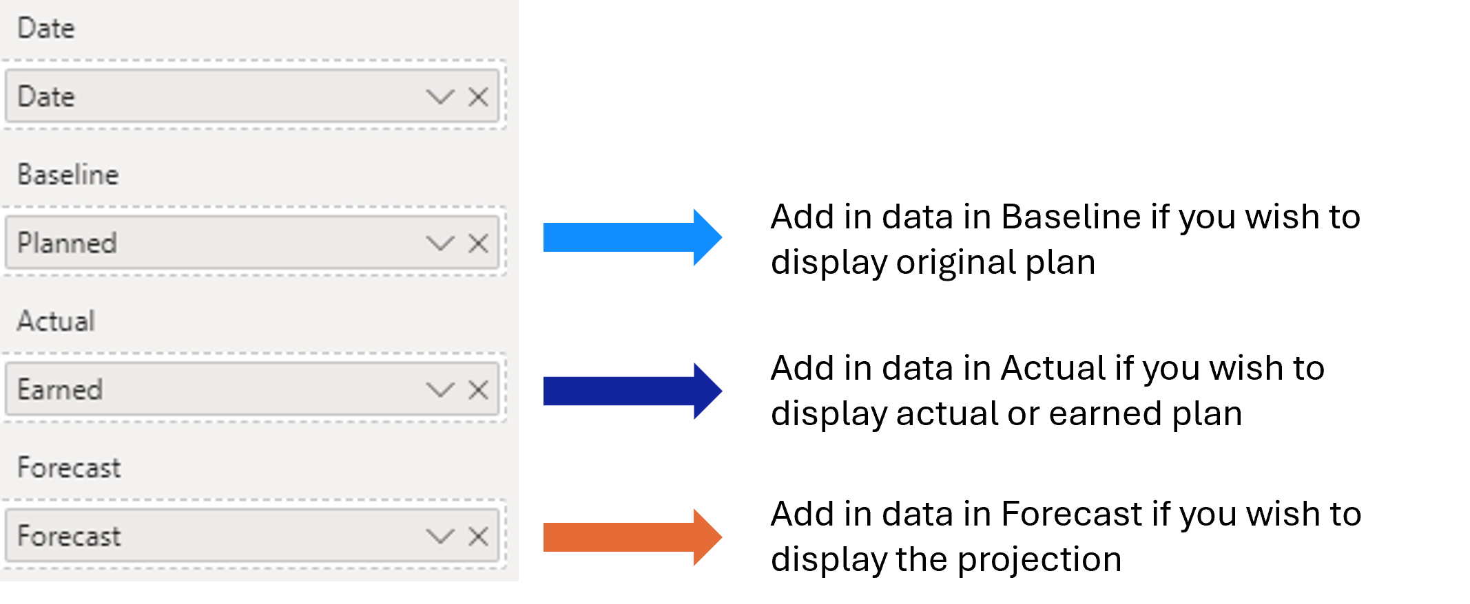
Drag and drop your data fields into the wells. In the example below, planned data is mapped to the Baseline field, earned data to the Actual field, and the Forecast field is left to automatic generation.
Formatting Options
The Format visual pane groups the visual's settings as follows.
Layout
- Auto Scale
- Auto
Data Options
- Data Type: Period or Cumulative
- Generate Forecast: on or off
- Forecasting Model: Linear Regression, Polynomial Regression, Exponential Smoothing, Linear Moving Average, or Exponential Moving Average
Data Labels
- Text size, display units, and decimal places
- Color, bold, and italic
- Label density
Line
- Select Line
- Type: Line or Area
- Thickness and opacity
- Style: solid, dotted, dashed, or dot-dashed
Legend
- Text size
- Position: top, bottom, left, right, or the centered variant of each
- Show or hide the legend title, and set the legend name
- Color
- Style: circle, box, line, or styled line
X Axis
- Text size and font color
- Tick density
- Type: continuous or categorical
Y Axis and Secondary Y Axis
- Text size, display units, and decimal places
- Font color
- Tick density
- Minimum and maximum
X Axis, Y Axis, and Secondary Y Axis Reference
- Color
- Thickness
Tooltip
- Label format
- Value display units and decimal places
Functionality
Tooltips
Hover over any point on the chart to see the values behind it without leaving the current view.
Forecasting
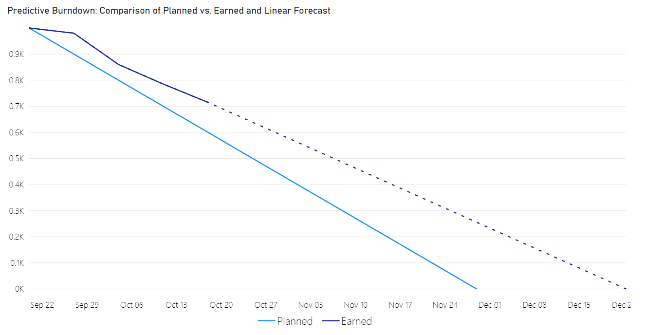
If your data has no forecast of its own, generate one from the history already plotted. In the Format visual pane, open Data options, turn on Generate forecast, and choose a model.
Linear Regression
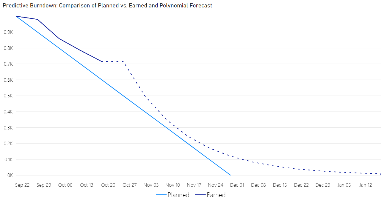
Polynomial Regression
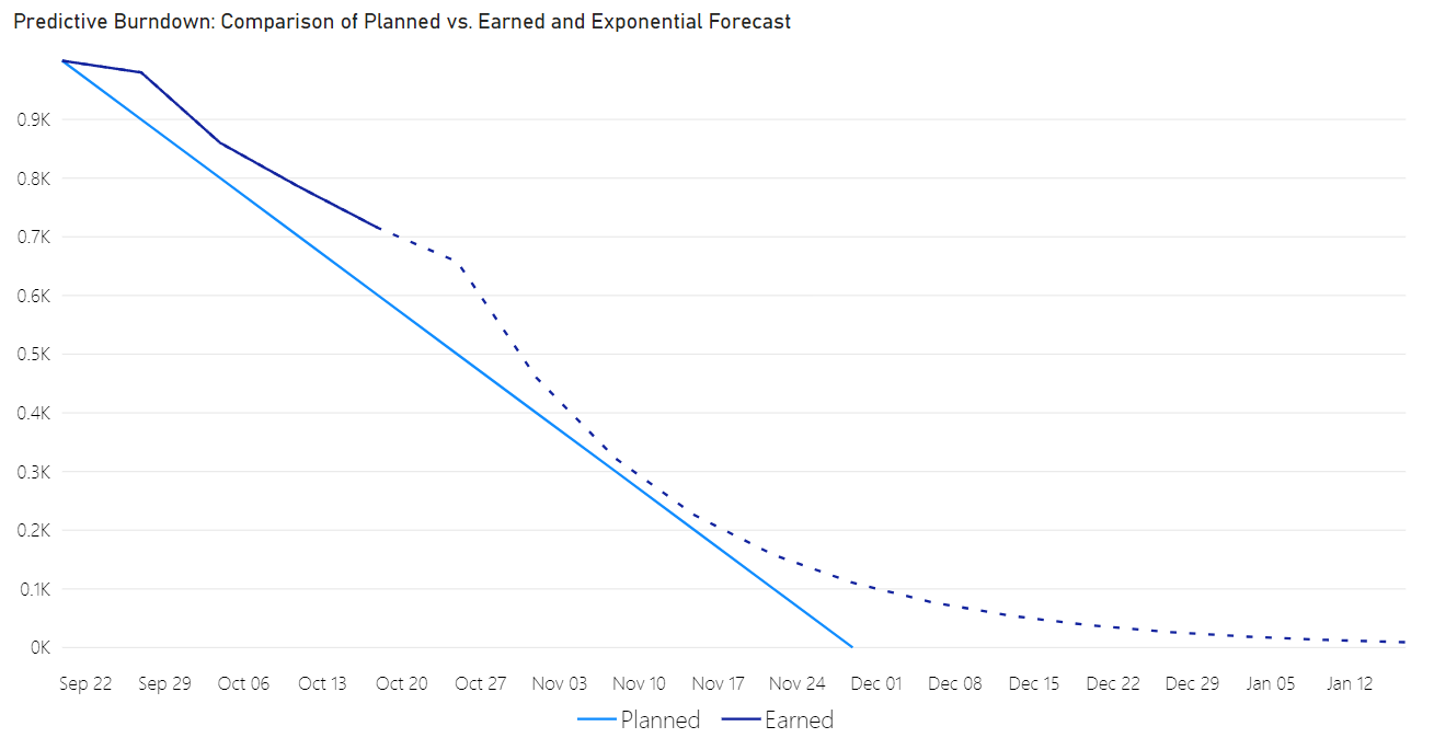
Exponential Smoothing
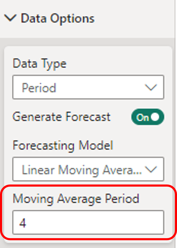
The two moving average models need one more setting. Set the Moving average period to the number of periods to average over.
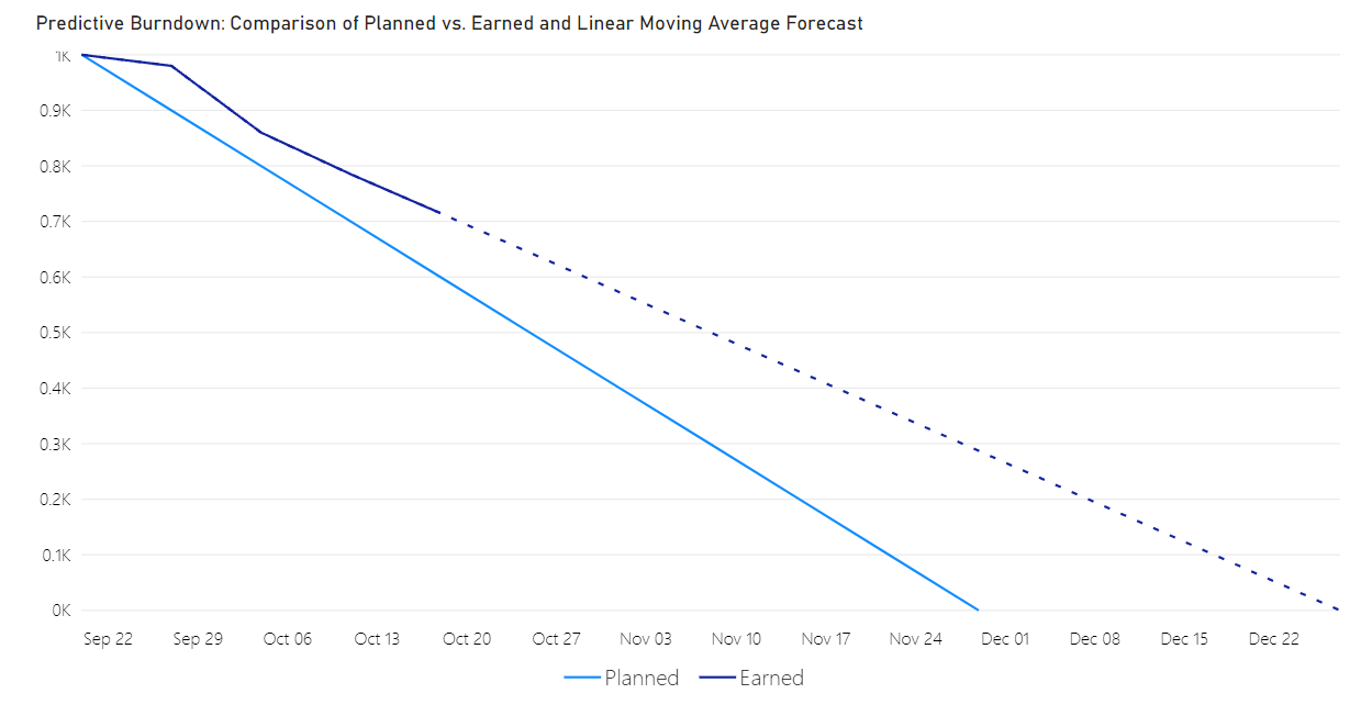
Linear Moving Average
Exponential Moving Average